Fuji X-H2 Review: Long term review for photography and filmmaking

Fuji X-H2 Review

As a professional photographer and filmmaker, I’ve had the Fuji X-H2 as my go-to camera for two solid years. From portrait sessions to rugged landscape shoots, and everything in between, this camera has seen it all. It’s high time I shared my thoughts about what I’d consider an almost perfect camera. In this post, I’ll break down my experience into two parts: 5 things I love about the Fuji X-H2 and 5 areas that could use improvement. Whether you’re a fellow Fuji user or considering adding the Fuji X-H2 to your kit, I hope my insights will help.

Before diving in, I’d like to mention that the Fuji X-H2 has been a remarkably reliable camera for me. In over 17 years as a professional photographer, it ranks among the most dependable cameras I’ve owned—on par with my old Nikon D800. No malfunctions, freezes, or glitches. It’s always responsive, which is invaluable when you’re shooting under pressure.

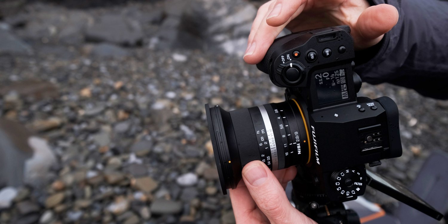
Fujifilm X-H2 review.

Let’s start with the positives.

5 Things I Love About the Fuji X-H2

1. Ergonomics

This is, hands down, one of my favorite features. The Fuji X-H2 just fits my hands perfectly. The grip is comfortable, even when using heavier lenses, and the button layout feels intuitive and well-thought-out. For anyone who spends long hours with a camera in hand, this is a big deal. The way it balances means I never feel like I’m going to drop it, even during long shoots.

2. Weather Sealing

As a landscape photographer, weather sealing is non-negotiable. This camera has faced weekly splashes from shooting seascapes, sub-zero temperatures down to -7°C, and 35°C heat without missing a beat. Additionally, I’ve only had to clean the sensor four or five times in two years—impressive, considering how often I swap lenses outdoors.

3. Image Quality

The X-H2’s 40MP sensor delivers stunning image quality for both stills and video. In well-lit conditions, the results are sharp and clean and I have no problem shooting indoors at iso3200.

4. Stabilization

Fuji claims up to 7 stops of stabilization, and while I think that might be a touch optimistic, the stabilization is undeniably excellent. I’ve consistently managed sharp images at shutter speeds as slow as 1/6 of a second with wide-angle lenses—a real asset for handheld shooting.

5. Battery Life

Battery life is another strong suit of the Fuji X-H2. On a full day of landscape photography, I usually finish with some battery life to spare. Of course, I always carry a spare, but the X-H2 has proven efficient, even during demanding shoots.

Fuji X-H2 long-term review

5 Areas That Could Be Improved with the Fuji X-H2

6. Stiff On/Off Switch

This has been an issue since I first got the camera. The on/off switch requires a firm push, and over time—likely due to exposure to salty sea air—it’s gotten even stiffer. It’s manageable, but wearing gloves makes it tricky to operate. On the bright side, I’ve never accidentally turned it on in my bag, a common issue with other cameras like the fuji X-T3

7. Battery Door

The battery door no longer springs open as it did when the camera was new. While it’s not a dealbreaker, it can be frustrating, especially if you have short nails. My older X-T3, which has been through similar conditions, still works fine in this regard, so it’s a little disappointing.

8. Stabilization at Slow Shutter Speeds

While stabilization is generally excellent, I’ve noticed a specific issue when shooting handheld at slow shutter speeds (e.g., 1/3 of a second). The center of the frame is usually sharp, but the edges sometimes show subtle motion blur. This isn’t a dealbreaker, but it’s worth checking your shots carefully when pushing the limits of stabilization.

9. ISO Adjustment Interface

Unlike aperture and shutter speed, adjusting ISO takes over the screen with a dedicated ISO scale. This interrupts the view of your scene and histogram, which can be inconvenient. I’d much prefer if ISO adjustments were displayed seamlessly, like other settings. (I’ve since been told that you can now assign iso to the front command dial which overrides this. Apparently it was in a recent firmware update but I haven't tried it yet.)

fuji x-h2

10. Weight

At 660 grams, the X-H2 is hefty for an APS-C camera. While its full-sized HDMI port, CFexpress card slot, and 3.5mm jack are useful features for some, I rarely use them. For my needs, a lighter camera with dual SD card slots would suffice. To put it in perspective, it’s almost the same weight as the full-frame Nikon Z7 II.

Final Thoughts

Despite a few minor gripes, the Fuji X-H2 has been an incredible companion for my professional work and creative projects. Its reliability, image quality, and handling have made it a standout performer, and the issues I’ve experienced are relatively small in the grand scheme of things. A lot of the photos in my galleries are taken with the Fujifilm X-H2 so if you fancy checking some landscape photos out click the button below

If you’re considering the Fujifilm X-H2, I hope this breakdown helps you make an informed decision.

Fancy learning more about the Fuji X-H2 - Feel free to watch my Youtube video below. 👇

Landscape photography along the Pembrokeshire Coastal Path

Landscape photography along the Pembrokeshire Coastal Path

A Morning photo Walk

Pembrokeshire landscape photography

37mm 1/400 f9 iso 125

The Pembrokeshire Coastal Path in Wales is more than just sea views. This 186-mile trail stretches along the coastline, with dramatic cliffs, peaceful woodlands, and historic landmarks. On a recent misty morning, I set out with my camera to capture its beauty.

The day began with a soft mist over the cliffs and a gentle sunrise. I took a photo of the light spilling over the cliff top, using an old sea groin as the foreground. As I moved on, I soon found a quiet woodland path away from the coast. The trees formed a peaceful tunnel, with light filtering through the canopy.

Pembrokeshire landscape photography

18mm 1/25 f11 iso 125

Pembrokeshire landscape photography

18mm 1/15 f11 iso 125

Pembrokeshire landscape photography

16mm 1/25 f11 iso 125

Further along, ancient stone walls covered in moss hinted at the land's history. Even in the mist, patches of wildflowers added color to the green landscape.

16mm 1/25 f9 iso 125

Pembrokeshire landscape photography

29mm 1/10 f9 iso 125

pembrokeshire coastal path

16mm 1/30 f9 iso 125

pembrokeshire coastal path

16mm 1/125 f8 iso 125

Back at the coast, rocky outcrops jutted into the sea, and coastal birds flew overhead. Near the end of my walk, a rustic gate marked the transition to open fields.

pembrokeshire coastal path

30mm 1/25 f8 iso 125

pembrokeshire coastal path

25mm 1/50 f10 iso 125

As I turned to leave, the mist lifted, This walk reminded me that while the sea views are stunning, the path and its woodlands are equally beautiful. The Pembrokeshire Coastal Path is a treasure trove of natural and historical wonders, offering something special at every turn.

pembrokeshire coastal path

16mm 1/15 f10 iso 125

pembrokeshire coastal path photography

17mm 1/30 f9 iso 125

IAN WORTH

By the way, if you're new here, my name's Ian, and I’m a Pembrokeshire-based landscape photographer. I offer photography workshops, guidebooks, and a number of educational photography courses. I also provide free educational content on YouTube, so please feel free to check out my stuff if you're interested.

Keep shooting

Ian

Amroth Landscape Photography

Amroth Landscape Photography: Discovering the Beauty of Amroth

Amroth landscape photography, pembrokeshire

Upon first glance, Amroth's expansive sandy beach may seem to lack potential for landscape photography. However, dig a little deeper and you will soon discover that Amroth is an absolute gem. Let's dive into a bit about this amazing coastal town before we uncover its photography potential.

Nestled in the picturesque county of Pembrokeshire, Wales, Amroth is a charming coastal village that offers breathtaking landscapes and a serene atmosphere.

A Glimpse into Amroth’s History

Amroth is steeped in history, with roots dating back to ancient times. This small but vibrant community has a rich heritage, with remnants of its past visible in the local architecture and landmarks.

The village was once an important coal mining area and even today, the remnants of Amroth's mining past can still be seen along the coastline, adding a historical dimension to the landscape.

Amroth landscape photography, Pembrokeshire, Wales

Why Amroth is Perfect for Landscape Photography

Diverse Scenery: Amroth's coastline is a paradise for landscape photographers. The long sandy beach, rocky outcrops, and dramatic cliffs provide a variety of backdrops for your photos. During low tide, the beach reveals fascinating rock pools and remnants of ancient forests, creating a unique and ever-changing landscape.

Amroth landscape photography, Pembrokeshire, Wales

Golden Hour: One of the highlights of Amroth is its spectacular sunrises and sunsets. During winter, it's possible to have golden light on the beach at both ends of the day.

Natural Wildlife: Amroth is also home to diverse wildlife, making it an excellent spot for nature photography. Keep an eye out for seabirds, including gulls, cormorants and oyster catchers which are often seen along the shoreline. The occasional seal and porpoise may also make an appearance if you are lucky.

Seasonal Changes: Like mentioned earlier, winter is a great time to capture the golden hour, but all seasons here have their own charm.

Tranquility: Aside from the school holidays, you can often find you have the entire beach to yourself, and this undoubtedly is one of Amroth's greatest assets.

What's to Shoot

Both ends of the beach offer great rock formations that have endless possibilities. These are best photographed at high tide. The middle section of the beach has a lot of old sea groynes and markers that work really well for long exposures; again, these are best photographed at high tide. At low tide, you will be able to capture Amroth's picturesque and colorful houses reflected in the wet sand. On a very low tide and after big tides, the sand can wash out and reveal remnants of ancient forests. These old oak tree stumps can make great a foreground interest. There's an abundance of rock pools that work well at different states of the tide, which are always worth a look.

Amroth long exposure landscape photography Pembrokeshire

Tips for Capturing Amroth’s Landscapes

There's so much to photograph at Amroth, but one thing to look out for is the speed at which the tides come in, so it's advisable to check the tide times before you venture down over the rock ledges at both ends of the beach. Apart from that, the parking is good and roadside, and there are cafes and pubs should you need to fuel up after an early morning shoot. Whether you're a local or a visitor, spending time in Amroth with your camera is sure to be a rewarding experience. Remember to take your time, appreciate the beauty around you, and let the magic of Amroth inspire your photography.

black and white seascape photography Amroth Pembrokeshire

IAN WORTH

By the way, if you're new here, my name's Ian, and I’m a Pembrokeshire-based landscape photographer. I offer photography workshops, guidebooks, and a number of educational photography courses. I also provide free educational content on YouTube, so please feel free to check out my stuff if you're interested.

Keep shooting

Ian


Wide-angle photography with the Nisi 9mm f2.8 lens

Nisi 9mm f2.8 lens review

I love shooting wide angle photography, especially seascapes, it allows the viewer to feel like they can step right into the image.

The Nisi 9mmF 2.8 lens is specifically designed for aps-c cameras and is available for Sony e-mount, Canon RF Mount, Nikon z-mount, Fuji x-mount, and micro four thirds cameras. If you're using a full-frame camera you would likely see a fair amount of vignetting.

nisi 9mm f2.8 lens

Nisi 9mm f2.8 lens - build quality

The Nisi 9mm f2.8 is made really well and looks fantastic. Around the bayonet, we've got a yellow rubber seal that seals the lens against the camera body, meaning you won't get any water ingress into your sensor. This is great, especially when you're shooting Seascapes when the sea spray is coming at you, so that's particularly good.

It's a manual lens, so no electronic connections. The focus ring is buttery smooth as is the clickless aperture ring. Photographers may not like the clickless aperture ring as much as perhaps videographers, so I guess it’s a bit of a double-edged sword, but it does feel particularly nice. It also has a metal lens hood.

On my first evening of testing the Nisi 9mm, I shot everything at F11 using the hyperfocal focusing method. This meant that everything from infinity to 0.5 meters would be acceptably sharp. This was great as I didn’t have to worry about my focus during the session as I knew everything would be sharp. I chose this method because the conditions were particularly challenging and I had to keep moving and adjusting my composition whilst trying to keep my gear free of rain and seaspray. Be sure to check out the video to see how I got on that evening

The Clouds were amazing 😀

nisi 9mm landscape photo

I enjoyed that session and the morning sunrise shoot too.

This lens does suffer from vignetting, especially when it's wide open at F 2.8. If I stack 2 filters I can then see some severe vignetting in the corners, so when I was using a six-stop and a polarizing filter I ended up cropping the images a little bit to get rid of the dark Corners.

Typically when I'm shooting seascapes I'm using a five-by-seven crop, so generally speaking, the very edges of the frame are cropped out anyway, so it's not such a big deal for me. If you want to use the full width of your image, you're going to have to correct that vignetting in Lightroom or photoshop.

Usually, I avoid using a polariser when using a wide-angle lens as sometimes you can get uneven areas of polarization, so I’m not sure how often I would stack 2 filters but it is something to consider.

The Nisi lens performs particularly well when you shoot toward the sun, flaring is minimal it's pretty incredible really when you're shooting directly at the light.

The lens can capture sun stars all the way through the aperture range from f2.8 up to f16 which is nice.

Typically if you want to shoot a Sunstar you have to stop the aperture down to f16 or f22 . If sun stars are your thing and you like shooting toward the light, I think you probably love this lens.

nisi 9mm f2.8 seascape

To conclude, having used this lens for the last couple of days shooting seascapes. I think the Nisi 9mm does particularly well shooting toward the light, I think it handles flare well and the detail when you're shooting toward the sun is fantastic. Image quality is comparable to that of my 10-24mm fuji zoom lens but the Nisi does lack contrast in my side-by-side comparisons.

The lens does suffer with vignetting and also some softness in the corners, to get over this, I just crop my image ever so slightly.

If you like shooting Sun Stars you're going to love this lens because you can shoot sun stars at all apertures which is pretty cool. Build quality is fantastic and the weather sealing definitely held up to everything that was thrown at it during these couple of sessions. It had a couple of waves over it and it got an absolute soaking from the driving wind and rain. I think this is a nice little wide-angle lens that can certainly do a job especially when you're shooting into the light.

f2.8 vignetting

f8 vignette

These images are darker on the right-hand side because my wall has window light coming from the left.

nisi 9mm

Pembrokeshire Landscape Photography Workshops

pembrokeshire landscape photography workshops

Pembrokeshire landscape photography workshop

Pembrokeshire photography tours & workshops

The breathtaking natural beauty of the Pembrokeshire coastline is a photographer's dream. The play of light on the sea and cliffs can transform a panorama. What can be calm and ethereal one day, can morph into a moody dramatic scene with a completely different atmosphere on another. Shooting coastal landscape photography in Pembrokeshire is something that brings great joy. Let me guide you with my Pembrokeshire coastal landscape photography workshops & tours.


pembrokeshire landscape photography

Pembrokeshire coastal landscape photography workshops & Tours

Coastal photography is exciting. The light can change very quickly on the coast, so a keen eye for composition and an awareness of how the light is moving in the landscape can yield some simply stunning images.

Whether you are new to photography and are looking for some guidance, or are experienced and looking for some new and exciting locations, I’m sure you will enjoy my photography workshop on the Pembrokeshire coast. Using my local knowledge and my years of experience as a professional photographer, I will take you on a memorable photographic adventure. Travelling with me, we will visit several different locations on the day taking full advantage of the tides and the available light to achieve the best results. Together we will work on Light, composition and camera settings. By the end of the day you will come away with some stunning seascape photography images, but more than that, I want you to enjoy the outstanding beauty of the Pembrokeshire coast. Once you begin your Pembrokeshire landscape photography adventure you will want to come back time and time again to this beautiful coast.

pembrokeshire landscape photography

I am currently running several landscape photography workshops & tours in Pembrokeshire, Wales.

If you would like to learn more about my workshops & tours, please click the button below for all of the details.

pembrokeshire seascape

pembrokeshire seascape photo

pembrokeshire landscapes

Alongside running photography tours throughout the UK, Ian Worth also runs an inspirational YouTube channel about landscape photography which gains around 2 million views per year. If you are interested in Ian’s approach to landscape photography, check out Ian on YouTube by searching for @ian_worth

pembrokeshire landscape photography tours

landscape photography in Pembrokeshire

Woodland photography workshops & tours

woodland photography workshops uk

Woodland photography workshops & tours

Woodland photography in my eyes is one of the most rewarding genres of photography, it’s more than just a photograph, it’s the whole experience of being surrounded by ancient trees which not only inspires me but also energises my mind, body and soul. For this reason, I love spending time in the woodland and to photograph it, is the icing on the cake.

Woodland photography one to one’s

Woodland photography is very unique in that it requires an incredible amount of patience, local knowledge and a keen eye for light and composition. Practice makes perfect is a term that fits well with woodland photography.

If you are looking to take your first steps into woodland photography or would like to explore a new location with a guiding hand then my woodland photography workshops and tours will be just what you are looking for. On the day we will visit multiple locations in my local woodland, working on light, composition and camera settings. 


I am currently running my one-to-one woodland photography workshops in Pembrokeshire, Wales but I also have many different photography tours throughout the UK.

If you would like to learn more about my workshops & tours, please visit the link below for all of the details.

Alongside running photography tours throughout the UK, Ian Worth also runs an inspirational YouTube channel about landscape photography which gains around 2 million views per year. If you are interested in Ian’s approach to landscape photography, check out Ian on YouTube by searching for @ian_worth

uk woodland photography

How to shoot time lapse photography on fujifilm cameras

how to do time lapse photography

Create amazing time-lapse photography with fuji x-t4 x-t3 x-t2 x-h1

Today I will be talking about how to capture amazing time-lapse photography specifically with a fuji camera, but if you are using another brand the core principles will apply however you may need an intervalometer or look at your user manual for how the built-in timelapse feature works on your camera.

At the bottom of the post you will find my youtube video which goes through all of these steps in detail.


A sturdy tripod is essential for capturing time-lapse photography as camera shake can ruin your end clip. It's also worth turning any lens or camera stabilisation off as the camera will be locked on the tripod. A couple of other settings you might want to check are that you have long exposure noise reduction turned off and make sure your camera's auto-off or power-saving function is switched off. We will be using all manual settings throughout the tutorials including white balance to make sure nothing changes during the duration of the time-lapse.

Time-lapse using the video mode on your fuji camera

So first up and the easiest method is to capture a timelapse using the video mode in your camera. Now, this is my least preferred method as it gives the least amount of control, limits our motion blur and doesn’t give us as many options for post-production. It is, however, the quickest way to set up and capture something similar to a timelapse, so for that reason when I simply do not have a lot of time on my hands then it’s still possible to get something decent.

For video, I shoot at 24 frames per second as this gives a cinematic look when used in real-time, usually, I’m shooting at 1/48th of a second for my standard video settings as this gives the correct amount of motion blur and fits the 180-degree shutter angle that is used for professional videography.  If required I could reduce the shutter speed down to 1/25 of a second which is the minimum I can go to when shooting video. This will give a little more motion blur for a more dreamy effect.

So we have our frame rate and shutter dialled in now we have to adjust the aperture and iso to set our exposure. If shooting outside during the day then iso will generally be at the lowest setting, that’s 200 on my fuji X-h1

Just remember that if we are speeding the video up later in post-production then we will have to shoot for longer. If I speed the footage up 10 times and I want a 10 second finished clip, my real-time video length needs to be 100 seconds long.

The next step would be to simply speed up the footage in your video editing software.

The downside to this method apart from post-production and shutter speed limitations is that we will need to increase the speed of the clip, meaning frames will be dropped as we try to squeeze all of that information into a shorter space of time. This can result in choppy footage as parts of the clip are discarded.


Time-lapse Fujifilm x series cameras

Time-lapse Fujifilm x series cameras


Using still photos is definitely my preferred method for capturing time-lapse photography, there are 3 main reasons for this. 

1 we have much bigger files sizes meaning a better quality image.

2 more flexibility in post-production, we can edit each frame just like a photo.

3 we have complete control over our shutter speed, frame rate and interval meaning silky smooth motion blur. 

To set up for shooting stills there is one massively important point that often gets overlooked and is one of the biggest causes for flickery footage and that is our aperture.

Now the aperture blades are incredibly delicate things and they open and close with a decent amount of precision but for the most part, not precise enough to capture the exact same exposure every time.

Every time an image is captured the aperture blades reset and become fully open, it’s only when the image is being taken that the blades close to the desired f-number. This means that during a timelapse of many photos, the blades will be continuously opening and closing. It’s these small discrepancies in exposure that can create a flicking effect in our finished timelapse.

My advice would be to choose a lens with a higher minimum f-number. Lenses with a minimum aperture of F4 and above are great. When shooting wide open at f4 on my fuji 10mm- 24mm f4 lens VIEW THE LENS HERE ON AMAZON the blades will always remain open and never move throughout the entire collection of images. Another alternative would be to use a vintage lens that doesn’t have an electronic aperture.

So I use my fuji 10-24mm f4 lens, now if I shoot wide at f4 I’m getting a large depth of field providing I’m not really close to my foreground subject so this works well.

HOW TO CALCULATE A TIME LAPSE

The next setting to think about is iso, and again this will be at my lowest setting of iso 200 if shooting in bright conditions.

This leaves shutter to complete the exposure triangle, now shutter speed will depend on what you're shooting and the overall look that you are trying to achieve. There's no right or wrongs,  it's more down to personal taste and experimentation. If clouds are moving really quick then a quicker shutter speed might work better, if they are moving slower, 2 seconds may give a better result. It really depends on what you are shooting, how smooth you wish the time-lapse to look and how quick your moving parts are travelling. 

Getting some motion in each image can really make your time-lapses flow smoother. Now the trade-off with a slower shutter and wide aperture is that we are more than likely going to be overexposed. This is where our friend the ND filter comes into play. 

Simply attach an ND to the lens to obtain the correct exposure.

It is worth mentioning that if you are shooting at sunrise then the exposure will be getting brighter throughout the shooting period, so you will need to take this into consideration when finalising your original settings.

The interval needed will depend on the speed in which objects are moving throughout the scene, if the clouds are moving at a decent speed, I would go for a two-second interval, if they were super quick, I would decrease the time to 1 second. If slower then I would increase the time to say five seconds, experimentation is key here. If the interval is not correct then the footage can either look too dreamy or too choppy. It’s worth mentioning that shooting at a shorter interval is better than a larger one, you can always discard frames in post-production, but you cannot add them if you didn’t capture them in the first place.

So with a two-second interval, now I need to work out the number of required frames. Here we need to work out a little math. I would like my finished timelapse to be 10 seconds long and 24 frames per second will be my finished video output. This means I need to multiply 10 by 24 to get my required amount of frames. An easy one to work out, that’s 240 still images.

Now let’s work out how long that will take to capture the whole set of images.

We have a two-second interval and we need to take 240 images that means we will need to shoot for 480 seconds.  

It’s always worth working this out so you know how long you will be hanging around for.

Apps such as photo pills have a timelapse calculator to save you working this out which comes in very handy.

Check out the video below for a detailed explanation.

As an amazon associate I earn from qualifying purchases.


Kase wolverine magnetic circular filter kit review

kase wolverine magnetic circular filters review

Kase ND filters

Today I will be talking about the kase wolverine magnetic circular filters, I’ve also uploaded a video review to youtube and you will find that linked at the bottom of this post.

Firstly I would say these filters are specifically designed for ease of use. They just make using filters easy and this is really what brought them to my attention in the first place. 

You attach an adaptor ring to your lenses which will bring all of your threads to the correct size to receive the filters. 

They come in three sizes, 

77mm, 82mm and 95mm. 

Each size having an entry or professional kit. I believe the only difference between the entry and professional kits is that the professional kits have a 10 stop filter included where the entry is just the 3 stop, 6 stop and a polarizer.

I use the 77mm set for my fuji set-up 

Once the adaptor ring is secured to your lens, you can now easily attach the magnetic filters.

I've found the magnets to be strong enough and I've never had one drop off. 

The filters are also stackable, meaning you can attach a polarizer and an ND filter at the same time.

When you are not using the filters you can attach the magnetic lens cap to the adaptor ring meaning that there's no need to remove the adapter ring when out in the field.

My professional 77mm set includes a circular polarizer,  a three-stop, a six-stop and a ten stop ND filters. 

The Nd filters are also stackable should you need more than a ten stop reduction in light.

The kit comes with a 77mm lens adapter, but if you need more or different sizes, you can buy them individually from the kase website. This means you can attach an adapter ring to every lens that you use making swapping filters quick and easy.

The set comes in a handy leather pouch that's nice and compact. The set of 4 filters, polarizer and pouch comes in at only 140 grams which is great for anyone who needs to keep the weight down in their pack.


Kase Filters build quality 

The build quality of this set is really nice, they feel tough and according to the kase website, they are scratch-resistant and repel water and dust. 

They’re made from toughened optical glass too so they should be fairly durable.  I did drop an nd filter on a gravel path during my last photography trip and it didn't leave a single mark, so from my experience, I can tell you that they are definitely tough.

The filters feel slim and tactile, I love the knurled edges and the lens cap is felt-lined and solid in construction. The pouch is leather, padded and well made too.

so overall the build quality is absolutely on point from a product in this price range.

Kase filters circular polarizer

So we have established that these filters are great in terms of ease of use and build quality but how do they perform. Are they colour neutral, do they vignette and how is image quality 

First, let’s talk about colour casts as this is always one of the first things I look for in a filter.

So you will notice in my test shots when you download them that the colour does shift ever so slightly as we move up to the 10 stop filter, just a touch more towards magenta but in my opinion, it’s so negligible that it isn’t  anything to worry about and certainly wouldn’t stop me from picking a setup, even when the filters are stacked they still perform amicably 

1st shot = no filters. 2nd shot = 10 stop ND filter

kase filters
kase magnetic filters

There is very little, if any vignetting, with 1 or 2 filters attached, even when I’m at 10mm on my fuji 10-24. 

We do start to see vignetting creeping in though, when we attach 3 filters when at 10mm we can also see the filters in the edge, but by increasing the focal length up to 12mm it drastically improves it.

In my experience and certainly, for the work I do, I don’t think I would ever have the need for attaching 3 filters but it’s something to bear in mind if you do shoot really long exposures with a very wide lens. If this is how you like to shoot,  my advice would be to go for a larger diameter set, but for me I prefer the smallest size possible as they take up less space in my bag.

The polarizer works really well and is probably the most effective I have ever used especially when used correctly at 90 degrees to the light source. It cuts through glare and really saturates the image. Perfect for my woodland images.. this shot was from last weeks video and you can clearly see the difference between the 2 images, the first being polarized the second without.

kase filters polarizer review
kase filters review

In terms of image quality I’ve seen nothing that concerns me and I feel completely confident in stacking the filters. Obviously having the filters attached means no lens hood unless yours can accommodate filters like this and although the filters have an anti-reflective coating you will need to shield the sun with your hand or something if you are shooting towards the light, but that's commonplace with any filter of this type if you are looking to minimize lens flare and reflections.

kase filters wolverine

It's really difficult for me to pick out many negatives with this set of filters but to make the review fair here's a few minor points.

These filters are obviously not of the graduated variety, so if you are looking for filters that will reduce exposure in certain areas of your image, then I would suggest looking at a modular system. For seascapes, graduated filters are very handy but for the majority of my photography I’m usually in the mountains or woodland, so graduated filters become not as useable and for this reason, I am preferring these at the moment. If I need to increase my dynamic range a simple bracketed exposure will often give great results if post-processing is used correctly. 

Another point I should mention is that the lens caps are a little pricey, but they completely solve a problem and for that reason, I believe they are worth the money and would advise ordering one for every lens that you take out on a photography trip.

I would like to see a belt loop on the back of the pouch so I could attach it to my belt, that way it wouldn’t be flapping about and I could leave it attached when walking. It’s slim enough to sit underneath a t-shirt and not be noticed, so that would be a nice addition.

You may see a very slight shift to magenta when using the Nd's. For me though, it's so negligible that I've only once had to adjust this in post production with an adjustment brush and white balance correction.

Aside from those few minor points and I am being picky for the sake of a fair review there’s really nothing bad to say about these and I will continue to enjoy using them going forward.

Kase filters for photography

I think these filters are for photographers and filmmakers that are looking for a compact weight-saving professional filter system that’s easy to use. I have been using these filters for both my photography and filmmaking exclusively over the past 5 months, virtually all of my YouTube videos during this time will have had one of these ND filters on the lens allowing me to keep my aperture wide and shutter at the correct speed. If you fancy taking a look at some of those videos, I will link to a couple in the description.


Viltrox 23mm F1.4 lens review

Viltrox 23mm f1.4 lens review

How’s it going, I hope you are well. In today’s post, I will be talking about the new Viltrox 23mm f1.4  Lens for Fujifilm. Now this isn’t a scientific review, where I point the camera at loads of charts, it’s more of a real-world test, but I will be providing you with a pack of images and video clips for you to download for free, so you can see for yourself how this little fella performs. There will also be a Youtube video at the bottom for you to check out where I deep dive a little further into the Viltrox 23mm lens.

Viltrox 23mm f1.4 lens review

Viltrox 23mm build quality

So first off let's talk about the all-important build quality.

The build quality is decent, it feels lighter than the Fuji XF 23mm f1.4 and balances really nice when mounted to the X-T3.  Overall it looks great too.

It comes with an awesome metal lens hood that fits on the front with ease, it definitely oozes quality. 

The lens mount is solid and the focus ring is buttery smooth, it feels great for manual focusing, but if I was to compare the overall feel with the fuji f1.4 I would say that the fuji feels more solid in terms of the overall build. 

This is probably to be expected though as the Viltrox comes in 40 grams lighter with an overall footprint of pretty much the same size. 

I guess the lighter weight could definitely be seen by some as a bonus, whereas others may prefer the more solid build of the fuji. To be honest I do like the overall feel of the Viltrox and wouldn’t hesitate to give it a thumbs up in this area.

viltrox build quality

Viltrox 23mm aperture ring

So the Aperture ring feels light and turns a touch more freely than I would prefer, it’s also clickless until you get past f16 where there's a click to confirm you have it set to the auto aperture mode.

I actually prefer a clickless aperture ring for video work as it allows for a gradual change in exposure and aperture settings without the hard stops you get from a clicked aperture. 

For stills though, I prefer my aperture ring to be clicked as it means it’s harder for the aperture ring to be turned accidentally.

So there’s a pro or con here depending on if you’re primarily a stills shooter or a video shooter. 

One thing I would say is that the aperture ring is so close to the lens mount that I've never accidentally turned it, so it's not too much of a big deal.

There is one fairly big caveat though with this clickless ring and that is that you don’t get that smooth transition in exposure that you would if you were using a manual lens.

(I explain this in more detail in my video where I compare it with an old vintage lens)

Another drawback is that we can hear the aperture blades move when the ring is moved. It's quiet as we move from f1.4 through to about f4, but then it tends to get fairly noisy.

It’s at its worst at around f5.6. Unfortunately, if you are using the camera's built-in mic, this noise will be recorded. I've tested it with an external mic attached to the hot shoe too and although not as noticeable it is still heard between f5.6 to f16.

So when it comes down to it, it makes the clickless aperture somewhat less appealing. The only positive is that it's a tad easier to turn when filming.

viltrox 23mm lens

Viltrox 23mm autofocus lens

Now let’s talk about autofocus and I think this is where this lens really shines. It's snappy and quick to acquire focus for stills and performs impeccably in most situations. It’s really quiet too which is a big improvement over the noisy Fuji XF lens.

Is the Viltrox quicker than the Fuji? 

Well, to be honest, I’m saying that it feels a tad quicker than the Fuji lens but that’s not a scientific result, just my initial thoughts?

For video though, it does have some quirks.

The STM motor is very quiet for video and can hardly be heard, so I really feel they got the balance right there. 

In continuous autofocus it's nice and smooth, tracks the subject well and focus breathing is kept to a minimum. The face detect works well too, especially on the x-t3.

So I have found a couple of issues. Firstly I haven't found a way of slowing the focus speed down and currently, it feels too quick for that cinematic look when pulling focus between two objects.Which is definitely a shame, I should point out at this point though the fuji 23mm lens sucks at this too and kicks off a grinding, whirring noise in the process. (I explain this in more detail in my viltrox lens review video)

Now I did find another little quirk with the continuous autofocus and that is when you have the aperture wide open and focus the lens and begin filming everything works as it should, however, if you bring the camera closer than the minimum focusing distance to a subject and then move the camera back it can't acquire focus again and everything becomes blurred. It doesn't matter where you point the camera, it just can't acquire focus again. 

This goes away though when you stop down to f2 and beyond. This could be an issue if you like to get an out of focus foreground or if you're shooting through something like a bush for example. (I explain this in more detail in my viltrox 23mm lens review video)

Manually focusing is a breeze though with the buttery smooth focus ring, especially if you set your manual focusing to linear as opposed to non-linear. You will need to dig around in the menu to find that and I believe it’s only available on the newer fuji models, from the x-h1 and newer I think.

CHECK OUT MY FREE ONLINE COURSES

Viltrox 23mm f1.4 image quality

So moving on to the actual image itself. How does it look?

Now one thing to mention here is that I’m the sort of photographer that looks at an image with the mindset of how well the image looks overall, I enjoy things like character, colour rendition and contrast, over whether an image is tack sharp when magnified to 200%. 

Now there’s certainly nothing wrong with zooming in and looking around an image for the finer details, but it’s not something I personally do that much. 

So as this is a real-world review as opposed to a scientific one, I will let you be the judge of the IQ yourself. I've taken a set of images and put them in a pack for you to download.

DOWNLOAD THEM HERE

I've taken a series of images with the fuji f1.4 and the same with the Viltrox 23mm lens so you can see the results for yourself and compare the two.

But if you want my opinion, here it is,  now are you ready for this. 

Well, in my opinion, the Viltrox is head and shoulders sharper than the fuji, that's not just in the centre but unbelievably sharper at the edges too. 

Now I’ve always known that the Fuji 23mm xf lens wasn't particularly sharp wide open and, to be honest, it’s never bothered me that much, but I've never had enough confidence in the fuji xf to shoot group photos unless I stopped down to say f5,6 where it improves somewhat at the edges.

So I can see the Viltrox could play a big advantage here for wedding and portrait photographers.

When you get down to f11 f16 the images are fairly similar in terms of sharpness, but let's face it, you're not buying one of these to shoot at f16. You want it sharp at f1.4 right and I have to say the Viltrox excels in this department.


VILTROX IMAGE QUALITY

VILTROX IS ON THE LEFT, FUJI ON THE RIGHT.

Overall when you are looking at the images side by side at normal magnification you can't really tell the two apart, the colours, bokeh and contrast are pretty much identical from my tests and this is great because I just love the way the xf looks and for that reason, it is one of my favourite Fuji lenses and my favourite focal length too. 

Overall  I really like the image quality of the Viltrox 23mm lens. The bokeh looks nice, it focuses nice and close and has a lovely feel to the overall photo. There is a vignette from f1.4 through f3.6 and there can be significant flare when shooting towards the sun, but fringing is kept to a minimum.

Personally, I don’t mind the slight vignette, it's easy to correct in post-production if you need to.

The flare though can be seen as either a pro or con depending on how or what you are shooting.

For example, when I’m shooting portraits of a couple during a portrait session it’s nice to get some of that flare in your image at times, but if I’m shooting a formal group photo at a wedding then flare can be a real nuisance. So definitely something to be wary of, but can be used to create stunning images too

conclusion

So who is Viltrox 23mm lens for and how does it compare with the fuji equivalent.

So this lens performs well for both stills and video but both have their little quirks.

Video shooters that don’t tend to use the aperture ring to change exposure, will be more than happy. Those that were hoping for that smooth transition in exposure will feel disappointed especially as the sound of the blades moving is picked up with both the internal and external mic. Focus pulling is not really possible unless you shoot in slow-mo which is disappointing.

The flaring, on the other hand, is lovely for video as is the manual focus.

Stills shooters will be sure to love the snappy autofocus, great image quality and nice build, they may feel disappointed with the slight vignette, lens flare and clickless aperture though.

So a lens at this price point should lack far behind a native lens that costs over twice as much, but it really doesn’t.

It's definitely worth the money and a great introduction for anyone looking to get a fast prime that doesn’t have the budget for the native glass.

I will definitely be using it through the coming wedding season and I will keep my blog updated for any future developments.

Here's a couple of further points that are worth mentioning

Viltrox are known for their firmware updates and I feel many of the little quirks could be ironed out with an update. Updating is easy with the micro USB port.  I should also mention that according to the Viltrox website, the lenses will not work with the x-pro line of cameras due to the mount. But you can check out their website for more details on that.

make sure to pick up the images and video clips to take a closer look at the IQ for this lens and feel free to watch the video below for demonstrations.

As an Amazon Associate I earn from qualifying purchases.


Kinder reservoir walk

kinder reservoir walk peak district

This Kinder Reservoir peak district walk begins and ends at the Bowden Bridge Car Park in Hayfield and marks the start of the Kinder Trespass which happened in 1932. Thanks to this moment in history, the hills of the peak district are now available for everyone to enjoy.

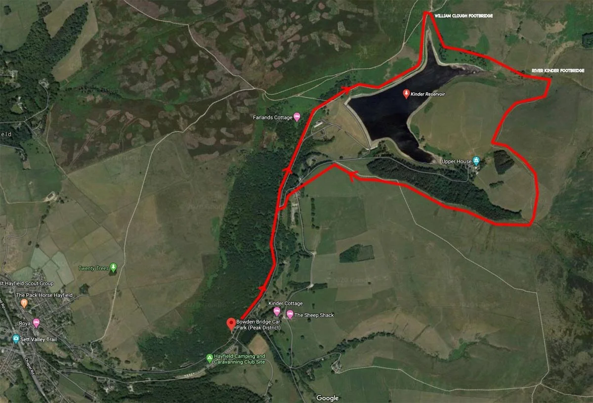
There are two ways to start this kinder reservoir walk, the first is a simple circuit which will start at the Bowden Bridge Car Park, this route is approximately 4.5 miles.

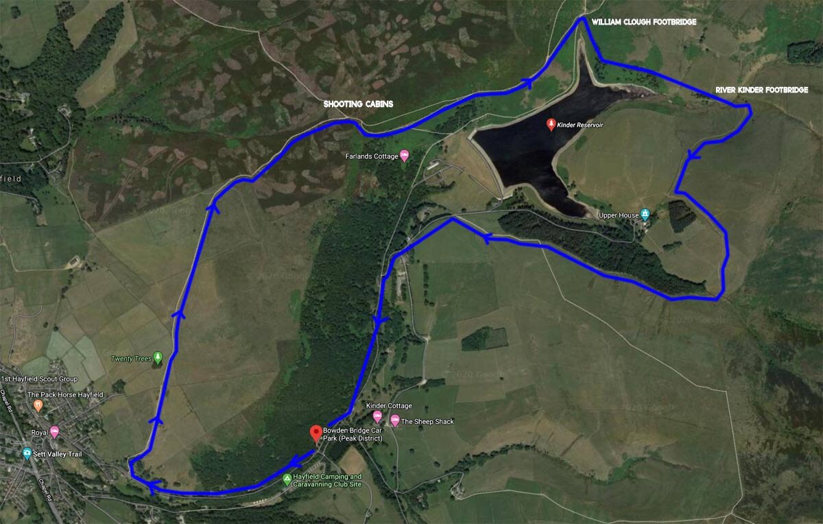
The second is about a mile further but absolutely worth it in my opinion. Taking the second option will take in some beautiful scenery to the west before some spectacular views of Kinder reservoir.


KINDER RESERVOIR WALK

Route 1 marked red on the map

  • Approx. 4.5 miles

  • Total ascent approx. 250 meters

  • Difficulty. Easy

  • Start & endpoint. Bowden Bridge car park

  • 165 Kinder Rd, High Peak SK22 2L

kinder reservoir walking map

KINDER RESERVOIR PEAK DISTRICT

From Bowden Bridge Car Park turn left and follow the road up towards the reservoir for about 800 metres. Avoid turning off the road as there are several right turns that should be avoided. Eventually, you will come to the start of the walking trail. Just follow the path upwards towards the reservoir, the dam will be on you right. Making your way up to the dam wall you will soon start to see the views of Kinder reservoir and the mighty kinder scout ridgeline. your route is clear now, simply follow the path by the water's edge and continue right down the reservoir keeping the water to your right.

After a mile and a half, you will reach kinder reservoirs most northerly tip. This is the start of William clough and you will see a beautiful footbridge that will take you across the stream. When you have reached the other side, simply follow the path to the right which heads through some lovely silver birches.

kinder reservoir landscape photography

Continue now for another mile and you will eventually end up at the river kinder which is the main source of the reservoir. Again here you will find a lovely footbridge that makes the crossing easy. After crossing the footbridge over the river kinder it's time to leave the waters edge and head over the hill towards Upper house. Upper house is the charming mansion that sits nestled in the hillside within some beautiful wooded areas.

kinder reservoir hike

You will want to look out for the copse of trees and head straight for it keeping it to your right. When you have reached the crest of the hill you will see the walking sign that directs you back to the kinder road. Just keep heading down now with the woodland to your right and you will eventually end up on the kinder road. Now just cross the river and head left back to the car park.

It's a beautiful walk and is suitable for the whole family.


WALKING KINDER RESERVOIR IN THE PEAK DISTRICT

Route 2 marked blue on the map

  • Approx. 5.5 miles

  • Total ascent approx. 350 meters

  • Difficulty. Easy-moderate

  • Start & endpoint. Bowden Bridge car park.

  • 165 Kinder Rd, High Peak SK22 2LH

kinder reservoir hiking map

Route 2 is definitely my favourite and starts at Bowden Bridge Car Park and is approximately a mile longer than the previous route.

This time we head right out of the car park past the sportsman's inn. After around 400 meters or so you will come to the start of the famous snake path. Turn right by the walking sign and head up between the buildings directly uphill. It is signposted here and after a further 300 meters you will see the copse of trees called twenty trees. Head towards twenty trees and go through a kissing gate and follow the path across the moors. The views out to the west and hayfield are beautiful. In the distance to the north you will start to see two white buildings, these are shooting cabins and they are a good marker to head towards.

kinder reservoir walk

Before reaching the cabins you will turn to your right over the brow of the hill you will see the spectacular and panoramic views of Kinder reservoir. Head down the hill for a little while and you will reach a dry stone wall that marks your path following the reservoir which will now be on your right. Follow this path until you reach the footbridge that crosses William clough. You will now be able to continue the same route as above from the William clough footbridge.

kinder scout walk

I hope you enjoy walking this route as much as me. To see more, take a look at the video below where I show footage of the whole route.


How to edit Landscape Photos in Lightroom

how to edit landscape photos in adobe lightroom

How to edit photos in Adobe Lightroom cc

There are many ways to edit photos in Adobe lightroom cc and I will be focusing on Adobe Lightroom’s two main modules. The library module and the develop module. Getting great looking landscape photos can be really challenging, but if you follow the steps below you will be creating great looking photographs in no time.


MAKE LEARNING LIGHTROOM EASY

To make the whole learning process easier I have developed an online course that will explain the whole process in more depth and detail. It’s available for FREE, just follow the link below for more information.

If you don’t fancy taking the course, no problem. keep reading for lots of editing content that will help you to produce great looking landscape photos.

How to use Library module in adobe lightroom

The Library module is where you view, sort, manage and organize your photos. Essentially your home base for working with photos after importing them into Lightroom. Viewing your photos in the library module is much quicker than in the develop module as the previews are a lot lower in quality meaning they render a lot quicker. This is great for sorting and culling your photos. At the top left, you will see your navigator, essentially you can choose how you would like to zoom into an image, here you can choose how zoomed in you would like to go when you click the zoom button to view your photos, I usually check 1 to 1. Further down, you will see your hard drives and the folders that you have imported into lightroom. To find the source file on your hard drive right-click the folder and choose Show in explorer, this is really useful if you can't find your original photos. At the bottom you will see the import and export buttons, this is where you will import more photos. Along the bottom, there are a few useful tools, the grid view, the full view and the comparison view. We will cover these soon. Along the bottom, you will see your film strip with all of your photos that are currently in the folder in which you are viewing. most of the panels in Lightroom are collapsable, which can help keep your workspace clean and tidy, just click on the little triangles to collapse a panel and click on them again to re-open them.

how to use the adobe lightroom library module

how to use The develop module in adobe lightroom cc

The develop module looks very similar to the library module but the side panels are very different. At the top left, we still have our navigator but below that we have our presets and history tabs, the presets tab will show all of the installed presets and our history tab will allow us to undo edits that we have made by skipping back in time. At the bottom, the import and export buttons have been replaced with the copy and paste buttons. The whole bottom section is very similar to the library module but the right-hand side is now very different. The right-hand side panel is our main editing panel, this is where the magic happens.

how to use the lightroom develop module

HOW TO IMPORT YOUR PHOTOS IN ADOBE LIGHTROOM

Importing photos into lightroom and your hard drive is really easy, but there are few important things to do to make sure things run smoothly. First insert your memory card into your card reader, enter the library module and click the import button at the bottom left. This will open up a new page which we will call the import module.

If your computer has read your sd card, then your photos may already be loaded into a grid-like view in the middle. If they haven't automatically loaded you can come over to the left and select your file in the source tab. Simply click on the drive or card in which you wish to import from, and the preview thumbs will start to load. It's important to note - when the images are loading in the centre - they have not yet been imported to your hard drive, this is just showing you which files you have on that card, folder or drive.

To help the files load quickly set your thumbnail size to the smallest by moving the thumbnails slider all of the ways to the left. I usually have my sort tab, set to capture time if I am importing photos. This helps when you look through the files later. If I have video files or other media that I will not be importing on that card then I will set my sort tab to media type instead. This allows me to quickly identify the video files and uncheck them as they will all be grouped together.

I always import all of my files from every card that I upload. I think it is easier to sort images in the library module, you can then delete the ones you don't wish to keep later. If though you only want to import one specific photo you can uncheck all of the photos - search for your photo of choice and just tick that one. This means that when we hit the import button, it will only import that checked file. You can view the photos full screen by clicking the photo view button at the bottom left.

At the top, you will need to select copy as you will be copying the photos to a new location. Over at the right-hand side is where we have our import settings. At the top right, you will see the destination drive in which the images will be copied to. If I click on another drive, you will see this change.

Coming down to file handling, I recommend checking the build previews as standard. Without going into to much detail here - this will render your develop previews for you at a standard size. This means it's rendering the files on import as opposed to the first time you click on an image in the develop module. What this means, is that it will take longer to import the files, but save you time when previewing the files for the first time in the develop module as the rendering part will already have been done. If you will be zooming into a lot of your images it might be worth checking the 1 to 1 preview as this will render a 1 to 1 file instead. This will take even longer at import but again could save you time down the line. I always go for standard though, as it suits my style of working. I tend not to bother with file renaming until export.

Moving down to the apply during import tab. For develop settings, you can choose to apply a preset to all of your images. I don't do this for my landscape photography as I like to edit each image individually as the look I'm going for is often very different. I always use this for my wedding photography and family shots as it gives me a uniform base edit to work off. This helps to keep my look consistent, I have a number of presets that I have built over the years that save me a tonne of time.

Going down to metadata - this is where you can add copyright into the metadata. You only really need to do this if you are planning to share your images on the web and you wish to retain the copyright to the image.

Below metadata we have keywords, I always add a few descriptive keywords, usually based around the location.

Moving on to the destination. As the name suggests this is where you choose where your photos will end up after the import. First, check the drive you wish to store the photos on. Then select your main folder. This might be the location you store all of your landscape photography on each year - so you could have a folder called landscape photography 2020 and for future years landscape photography 2021 and so on, this will help organize your photos for each year. If you click on landscape photography 2020 and highlight it, then go up and check into subfolder, you will then be able to create a subfolder that sits within that yearly folder. This could be 01 the location then raw. ie: 01-lake district-raw. I find it is good to put a number first - that way they will all be in the order of the date captured. This method of filing is how I do it, but if you already have a system that works for you, then you may want to stick with how you are currently doing things.

You will want to make sure that organize is set to - into one folder, that way if you have multiple cards, that were shot over multiple days, all of the photos will end up in the one folder as opposed to multiple folders. When everything is correct, simply hit import and get on with something else while lightroom does its thing.

The adobe lightroom import module

HOW TO SORT AND CULL YOUR PHOTOS IN ADOBE LIGHTROOM

After your import is complete you will see your destination folder in the folders tab in the library module. If you have imported photos on many cards, sometimes you will only see the last imported card in the film strip at the bottom. Just come over to the left and click once on your folder to bring up all of the files within that folder. You should now see all of your files in the film strip at the bottom. This is where we will cull or select the photos that we will be working on.

There are many ways in which to mark your files, but I like to flag mine. You can use P to pick and U to unpick your photos for selection. Use your arrow keys to move along the film strip from left to right. Right hand on the arrows and your left hand on the P and U keys. I use my index and ring fingers of both hands, but just choose what works best for you, it will also depend on where your arrow keys are situated on your keyboard.

When I'm culling large quantities of files, this method is super quick. If you like the photo hit P to flag it, if you don't like it, hit the right arrow key to move to the next image. keep doing this until you reach the end of the film strip. When you reach the end it will be time to select those files. Press the shortcut key ctrl L to enable filters, then click filter by a flag and flagged only. This will make the images in the film strip visible that you've previously flagged and the ones you didn't flag will become invisible in the filmstrip. Don't worry your unflagged images have not been deleted, they're just not visible, to make them visible again, just hit CTL and L to disable filters. All of your photos will now be visible again in the film strip.

When you have flagged your images, you can now go back through them and cull them further, if you have multiple versions. Simply press U on the flagged images to unpick them, this will make them disappear from your selection in the filmstrip. You can use compare view if you wish to view 2 similar images side by side - the shortcut key is C to switch between normal and compare view. The highlighted image will be your selected image, use the left and right arrow keys to scroll to your candidate image. The candidate has a little black diamond on the top right hand corner of the thumbnail in the film strip. This is a great way of choosing between 2 very identical images. Again just hit U on the image you wish to discard to unflag it.

THE DIFFERENCE BETWEEN GLOBAL AND LOCAL ADJUSTMENTS IN LIGHTROOM

In the develop module, we have two main ways to apply edits to a photograph. These are called global and local adjustments. Global adjustments mean that we will apply an effect to the whole of the image. As we move the exposure slider to the right we are adjusting globally to the whole image. As we move through the different editing tabs on the right you will see that whenever we adjust the sliders it is applying that adjustment to the whole of the photo. local adjustments are as the name suggests - they make adjustments locally, when an adjustment is made locally the adjustment will be targeted to one or several parts of the image as opposed to the whole image. This is how we can get really selective about which parts of the image we apply certain edits to. For example, we might only want to bring the exposure down in the sky area and not the land part of an image. With tools like a graduated filter, this is easily achieved, but we will be looking in these tools a little further on.

USEFUL SHORTCUTS IN ADOBE LIGHTROOM CC

There are many useful shortcuts that we can use in Adobe Lightroom and getting to know your keyboard shortcuts can really save time when you are editing lots of photos.

  • Here are some that I frequently use.

  • P to pick or flag a photo

  • U to unpick a flagged photo

  • 1,2,3,4,5 giveS a photo a rating out of 5

  • 6 to set the colour label to red, usually I set my edited web-ready images to a red colour label

  • 9 to set the colour label to blue, usually, I set my edited print-ready images to a blue colour label

  • L turns the lights out, keep hitting L to turn down the background brightness. This allows you to see your images clearer

  • F to go full-screen press again to go back

  • I to show your camera information

  • ctrl and the + & - keys to zoom in and out of an image

  • Ctrl shift and E to go to the export menu

  • Ctrl L to enable filters

  • R crop tool

  • M Graduated filter

  • Shift M Radial filter

  • K Adjustment brush

  • W white balance selector

  • O when working with a brush shows the mask

  • O when using the crop tool to show overlays

  • Hold alt when dragging a slider to show where or how the effect is being applied.

  • \ to toggle between your edited and unedited photo

  • C to choose compare view

  • Ctrl-A to select all of your photos in the film strip

  • Ctrl D to deselect all of your selected photos in the film strip

  • These are based on the PC if you are using a mac then swap Ctrl for command.

There is also a much larger list of shortcuts on the adobe website.

The basics tab including white balance and profiles.

using lightrooms histogram to get better photos

Before we go through the basics tab, let’s briefly talk about the histogram.

The histogram shows the exposure of your photo in a graph format. The histogram is a really powerful tool and it can help us to achieve a balanced photograph. Essentially the histograms graph displays the number of pixels that are displayed of a particular tonal value, everything that is black is on the left everything white is on the right. In the middle, we have mid-grey.

The higher the graph goes in a particular area shows how many pixels in the image fall within that particular tonal value. If I move the exposure slider to the left we will see that the image becomes underexposed and the histogram bunches to the left meaning most of the pixels are very dark or black. If we move the exposure slider to the right then we will see the exact opposite. The image will become overexposed and the histogram will bunch to the right where most of the pixels will show as white.

If you ever want to reset any of your sliders just double click on the word or the slider indicator.

In the basics tab, we can select whether we would like to work with a colour or black and white image. Below that we have the profile tab. By default, it is set to adobe colour. If you are shooting in raw, which I highly recommend, you can choose a different colour profile to work with. You can also save your own profiles or purchase them online, they are similar to a preset, but a profile will not make adjustments to your sliders where a preset will. If your camera has colour profiles attached you will be able to find them here. I use fuji cameras and if I scroll down I will see the fuji film simulations available for me to apply to my raw file.

Next up we have the white balance tab, This is where we can change the temperature and tint of the whole image on a global level. The temperature is measured in the kelvin scale, which is a scale that measures temperature the warmer the image the higher the Kelvin value, the higher the Kelvin value the more yellow and orange the image becomes. It’s the exact opposite for cold the lower the kelvin value the cooler the image becomes represented by the image going bluer in colour.

Below the temperature slider is the tint slider. If we compare the colour wheel to a compass, yellow is north then blue will sit directly to the south on the opposite side. The same is said for tint green sitting to the west and magenta sitting opposite to the east. Moving the tint and temperature sliders together will give us control over the whole of the colour wheel.

Using the colour picker or by hitting the shortcut W will allow us to use lightroom’s brain to do the work for us. Simply select an area that is completely mid grey and watch the colour and temperature sliders change in unison to give us a good starting point for our colour correction. keep using the picker until you get close to the look you are going for.

Next, we are moving down to the tone section. All of these sliders affect the image on a global level. I tend to stay clear of the Auto tab as I like to have full control over my edit.

Exposure - This one easy - simply drag to the left and it will darken the image, drag to the right and it will lighten the image. Press the shortcut J to see when your image is clipping or losing detail in the highlights or shadows. The clipping warning for the highlights is marked in red and the shadows marked in blue.

Contrast - Next is contrast, by adding contrast, essentially we are making the darker parts of the image darker and the lighter parts of the image lighter giving us more contrast. Watch your histogram as you add more contrast, the darker and lighter parts of the histogram get pushed more to the edges. The opposite will happen if we dial in a negative amount of contrast, watch the histogram move more towards the centre. I would use the contrast slider very subtly as there are more selective ways of adding contrast below.

Highlights - The highlights slider does as it suggests, increases and decreases the highlights in the image without affecting the shadows. This slider can be really helpful for recovering areas that looked too bright in the sky or water.

Shadows - the shadows slider does the exact opposite to the highlight slider affecting only the shadows, Using these 2 sliders in tandem is a great way of recovering areas of the image that are near to being over or underexposed, its also a more selective way of adding contrast.

The white and the black sliders are very similar to the shadows and highlights but affect the lighter and darker parts of the image, you need to be careful with these sliders but they are a great way of selectively adding contrast to an image. You can hold down Alt on many of the sliders to see how it affects the image. Using alt on the blacks, for example, will show us when a part of the image becomes completely black. If you are making global adjustments to a photograph for a quick edit using all of the sliders above in unison can give you a really quick edit and a nicely balanced shot.

Moving down to the presence tab, Texture increases or decreases the amount of medium size texture in a photo without affecting finer details. It's a great way of adding in some detail to your photo without adding in more contrast.

The clarity slider is similar to contrast, but it works a bit differently. The contrast slider affects all of the tones in a photo, while the clarity slider works more on the mid-tones. By increasing the clarity you will be bringing out more edge detail and by decreasing the clarity you will be softening the edge detail. You need to be really careful with the clarity slider as it can make the image look very grungy if pushed too high, I tend to never take it past + or -10

The dehaze tool work similar to clarity and can be great for adding or removing atmospheric conditions such as mist and fog to an image.

Vibrance is a tool which increases the intensity of the more muted colours and leaves the already well-saturated colours alone. The vibrance slider is great for portraits as it will leave skin tonnes alone and add in saturation to other areas of your image.

Saturation will boost the overall intensity of the colours in you photo just dial in the required amount.

HOW TO USE THE TONE CURVE IN ADOBE LIGHTROOM

The tone curve is a very useful tool and one which I use a lot. If you look at the tone curve you will see it represents the histograms graph. On the graph, we can see a line running diagonally from the bottom left to the top right. We can drag this line around to change how the tonnes in the photo are displayed. If we drag the bottom left-hand corner up you will see our black start to fade, if we drag it to the right we will see the blacks start in increase. Watch how the histogram changes as we move the tonne curve line. We can do the exact same to the white point too. If we drag it to the left the image has more white in it, if we drag it down we will push the histogram more towards the mid tonnes. This is really useful for setting our white and black points within an image.

The reason it's called a tone curve is that we can bend this line, by doing this we are able to manipulate the tones within the scene.

To add contrast, an S curve can be added. Lightroom has a couple of presets that are a good starting point to add medium or strong contrast. You will see the line becoming more shaped like an S. The shadow area on the left has been pulled down and the highlight area has been pulled up giving the overall image a boost in contrast. You can move these points further or less.

The tone curve is great because it's so flexible. It allows you to add contrast exactly where you need it. You can learn more about the tone curve by clicking on the line on the right. This will bring up 4 sliders, drag these and you will be able to see the tone curve move. This is a great way of learning the tone curve.

If you need to get rid of any points that you placed, simply double click them to remove them. If you need to adjust a part of your image and you're not sure where to start, click on the picker and start to drag it, you will see exactly where the tones fall on the graph.

Be really careful with the curve, try to keep it nice and gradual, having big steep curves can make your image fall apart and look really garish.

To the right we have our channel selector, by default, this is set to RGB meaning the curve will affect the red, green and blue channels at once. But we can break this down to single colour channels by clicking on either red, green or blue. Just for a quick example, by using the specific colour channel we can manipulate certain colours within either the shadows, mid-tones or highlights. If you look at the colour wheel you will notice that cyan and green is directly opposite red, so if we drag the red line up it will add red into the shadows but if we drag it down it will add the opposite colour to the shadows, in this case, a greeny cyan colour. Using the colour channels is a complex way of colour correcting and can work very well in some circumstances. In most cases, though I prefer to do my colour manipulation in the HSL tab.

HOW TO USE THE HSL IN ADOBE LIGHTROOM

Below the tone curve, we have the H S L Tab, H S L stands for hue, saturation and luminance. This is where we can selectively manipulate each colour individually.

I think this is a really useful tool if used subtly. I also think it is a lot easier to use than the individual colour channels on the tone curve. If you click on the All button we will see all of the HSL sliders and this is how I like to work.

To the left of each section, we can see the colour picker. We can use the picker to click on colours in our image that we would like to select and manipulate. Simply select the picker, drag it to the colour you wish to change and drag up and down while holding the left mouse button, you will now see the selected colours move on the relevant sliders. We don't have to use the colour picker though, we can slide the sliders independently just by dragging them.

At the top, we have our hue slider. As the name suggests we can change the hue of a particular colour. let's say for example we wanted to give an image a teal and orange look, all we would need to do is drag the yellow slider more to the orange hue and the blue slider more towards the teal colour.

Now below the hue, we have our saturation sliders, this is where we can adjust our colour saturation or the intensity of the colour, again this is really useful.

Now moving down to the luminance, again this is another useful tool. this allows us to change the brightness of a particular colour. So if we want to darken the sky we can grab our colour picker and pull down on the colours that we would like to darken.

Using these methods of controlling colour can be a very powerful way of editing.

If you are working in black and white and you have checked the black and white tab at the top the HSL will now become B & W.

Using this tab allows us to selectively dodge and burn certain colours within our image, dragging sliders to the left will darken them and dragging them to the right will brighten them. obviously, as we are working in black and white we cant see the colours, using the colour picker to choose an area that we wish to change can be really useful here. Let's say we want to make the sky a lot darker and more dramatic. We can do this by using the picker and dragging down on the part of the sky that we would like to darken. we can do the same for the land. Again another powerful tool here in lightroom.

GET CREATIVE WITH SPLIT TONING IN LIGHTROOM

Split toning is another great way of adding colour to an image, this time though slightly different. With split toning, we can add colour to either the shadows or highlights of an image. let's say for an image we want to warm up the highlights and cool down the shadows. First, we need to choose a colour for our highlights so let's pick a warm tone. Click on the small rectangle to get a better view of our colours and use the picker to choose a warm orange, by doing that we can see our slider has moved, we can move the slider manually as well, by holding ALT on the keyboard we get a view of the colour that we're adding. Now we can increase the saturation slider until we have warmed the highlights sufficiently.

If we reference the colour wheel we can see which colours complement each other, complementary colours sit opposite each other on the wheel. Opposite colour for orange is teal, as these colours complement each other we can add some teals into the shadows to cool them down. We can adjust the balance between the highlights and shadows by moving the balance slider, to get the required look.

We can see the before and after by using the toggle button. Again it's probably best not to push the slider too far as things can get a little false looking.

SHARPENING IN LIGHTROOM

In the sharpening tab, we can sharpen the image, I usually do this as my last step.

Now, how sharp you would like your image is obviously going to be a personal thing, I don't tend to sharpen my images too much, the fuji cameras that I use don't have an anti-aliasing filter, meaning that they are sharp straight out of camera, but if you use a camera with an anti-aliasing filter then you may need to apply a lot more sharpening than I would.

Usually, I keep my radius to 1, essentially this controls the size of the sharpening. Below that we have the detail slider, this is the slider that I use to sharpen my images and usually move this up to around 90, I then bring up my amount until I start to see any artefacts creeping in. Usually at around 20 is good for my cameras. To control where the sharpening is being applied, we can hold ALT and drag the masking slider to the right.

Everything in the image that is white will have the sharpening applied. Everything black won't, so just move this until you see the desired effect. Now, this method works well for cameras with x-trans sensors, but if you are using a camera with a Bayer sensor then you may wish to sharpen differently.

When I shot with my Nikon d800 I used to leave my detail slider at 0, radius at 1.0 and slide the amount to around 70, again using the masking to be selective about what is sharpened in the image.

I think sharpening is very subjective and varies from camera to camera. So my best advice would be to zoom into your image at 1-1 and play around with sliders and chose what works best for your eye.

Transform, lens corrections, effects

Lens correction can help if we see fringing on edges of tree branches for example. This is commonly known as chromatic aberrations. You can also apply a lens profile to correct things like distortion.

My cameras have a built-in profile so I never need to use this tab apart from the remove chromatic aberrations button. I usually keep this checked.

If you are using a different camera to me, you should be able to find your lens model in the drop-down menu, select your lens and lightroom will apply the relevant corrections for you.

I don't tend to use the transform tool very often, but it can be helpful sometimes if you need to control distortion or straighten things up a little. If you play around with the sliders you can adjust angles and rotate the image if needed. you will need to crop after you have made the adjustments to get rid of any white space.

Dropping down to effects. This is where we can add a vignette to your image, I tend to do this with a radial filter as it has more controls but you could do it here if you want a quick edit, simply drag the amount and feather it to taste. The further to the left we drag it the darker the edges become.

Below the vignette we have grain, like the name suggests this is where we can add film grain to the image, I don't use this for landscapes, but if you do, you can slide the slider to the right to add more grain, pretty straight forward.

Tools - Crop - spot removal - graduated filter or gradient tool - radial tool -

While making global adjustments is a really quick way of making an edit, local adjustments have far more control and its these tools that can really bring an image to life.

crop tool

First up we have the crop tool, this is a great way of adjusting your composition or removing distractions around the edge of the frame or even for choosing a different crop ratio. Click on the crop tool and drag the edges to help you recompose the shot. We can adjust the angle of the crop by moving the angle slider or if we have a straight horizon we can use the level tool to drag a line along the horizon line the crop will then be levelled along that line. The aspect is as it sounds either landscape or portrait orientation. Clicking on original will allow you to select a ratio for example 5 x 4 or 16 x 9. If you press O on the keypad when you are using the crop tool, you can scroll through different overlays such as the golden ratio, these can help to recompose your shot. I usually leave mine on the standard rule of thirds setting. If you wish to have free control over your crop then click the padlock button and drag the sides independently of each other.

Using the crop tool is non-destructive, so you can change it at any time, one thing to mention though is that if you take an image into photoshop to do some work and then bring that image back into lightroom you will have fixed the crop. For this reason, if I plan to take an image into photoshop I always take off the crop first and then I have the full image to adjust the crop later.

Spot removal tool

The spot removal tool is a great way of removing objects in a photo, simply click on the tool, adjust the size by dragging the slider or using the wheel on your mouse. Click on what you wish to remove and drag out the other circle where you wish to clone from. it's really easy to use but can be problematic for big or tricky areas. For bigger areas, I would usually take an image into photoshop and work from there.

The graduated filter is another excellent tool for selectively changing characteristics of certain parts of an image. Simply select it and drag it over a part of an image that you wish to change We now have a plethora of controls at our disposal, very similar to the basics tab but we are only applying these effects to the area of the image where the filter is applied. To see your mask, hit O on the keyboard. We also have the ability to add in a range mask, this means we can mask out certain areas of the filter.

The radial filter

The radial filter works very much the same as the graduated tool however this time we are applying the effect either inside or outside of a circle. This is great as we can make our selection to very small areas of an image or very large areas of an image. let's say we would like to add a vignette to an image. let's drag out our radial filter so it fills most of the scene. Now let's reduce our exposure a little. Everything outside of the circle is having the effect applied, we can adjust the feathering by moving the feather slider. If we want our effect to be applied to everything inside the circle. To do this we have to select invert. Now we are affecting everything inside. Again just like the graduated tool we can add a range mask to remove certain colours or luminance from the filter.

The adjustment brush.

The adjustment brush is a great way of getting selective about applying local adjustments. this is great for applying dodging and burning to an image. First, select your brush then boost the highlights and exposure slightly. This will be our dodging brush. Apply some dodging to an image, we can adjust the settings after we have done our painting to the desired level. Click done when we are finished, then open another brush tool and paint in some negative exposure to the shadows to burn them. If we over paint an area simply hit ALT on the keyboard and paint out that area of the brush. Again use the O key for the orange overlay to see where you have painted. At the bottom, we have the ability to change the brush size and add a range mask as we did before with the graduated and radial tools. If you need to remove any of the adjustment filters that you have applied simply right click on the grey button and click remove. These tools are some of the most powerful features in lightroom and let you be really selective about the adjustments that you make.

MAKING PRESETS AND SYNCING EDITS IN LIGHTROOM

If you have a number of images that you would like to make the same edit too, lightroom has a sync feature, and it's really simple to use. Firstly highlight the image that you would like to copy the settings from in the film strip. You can then either highlight a bunch of images by holding shift and clicking on another image to highlight everything between those 2 images or you can manually select images by hitting control and highlighting each image you wish to copy the settings to.

To select the whole of the filmstrip press CTRL and A. Just remember that it will sync the settings from the first image that you highlighted. Next simply hit sync for it to apply all of those settings to all of the images. Another great way of copying settings is by making presets. I use presets all of the time, especially for my wedding work where time is money. You can make your own presets of your favourite settings by firstly highlighting your image from where you wish to save the settings from, then come over to the plus button on the presets tab. Give your preset a name and add it to a folder of your choice. I have all of my presets numbered as well. I have my most commonly used ones at the top. Most of my presets are designed for my wedding and portrait photography. When you have selected your folder, you will need to check which effects will be saved as the preset, for example, you might not want to make a change to the white balance, i usually leave this unchecked. Simply press create when you have finished making your selection. You can now apply that preset to any photo by clicking on the preset. You can even share your presets with others by exporting them.

CREATING HDR, PANORAMAS & HDR PANORAMAS IN ADOBE LIGHTROOM

Stitching a panorama is easy in lightroom. Simply select your images by holding ctrl and highlighting them, then right-click and select photo-merge then panorama or click CTRL M on the keyboard. In the megre window you can see we have a few options to make this image stitch together the best. I tend to give each one a try and move the boundary warp up until it fits most of the image. I tend to either go for the one that either looks the best or has the least amount of boundary warp added. Now if you have set your pano up properly on a tripod, your image shouldn't need as much warping. This is why taking your time in the field is so important. But sometimes you just don't have the time and getting something is better than missing it completely.

If you have some defects around the edge a great tool to use here is the fill edges tool, effectively lightroom is using content-aware to clone in those edges, quite often this works really well and means that you don't have to do as much warping. You could crop in a little to remove those areas after and sometimes this is a better option. If you check, create a stack when the pano merge is complete, all of the images used will be grouped together in a stack.

For blending exposures, we can use the HDR blending feature built into lightroom. This is a great way of increasing the dynamic range of an image. If we can't achieve an even exposure in one shot HDR blending can be a great tool.

Of course, we will have to bracket our images when we are shooting for this technique to work. To make this technique work well, we need to have the camera locked down on a tripod for the best results. simply highlight our set of bracketed images and right-click photo merge HDR or CTL and H on the keyboard. I usually leave auto-align layers checked in case there was some movement during the shots and leave de-ghost to none. Create a stack to group the images together and click merge. Job done!!. We now have an image with a lot more dynamic range where we can pull lots of information from the highlights and shadows.

The hdr pano is very much the same but it will blend bracketed images together whilst creating a pano, very much in the same way that we talked about above.

HOW TO USE SMART COLLECTIONS IN LIGHTROOM

Creating a smart collection is a really great way of grouping together a collection of photos for quick access. I have just one smart collection called landscape photos. essentially this is a collection of all my landscape photos that I regard as keepers, the ones I might share on Instagram or my website or even make a print from. When I have finished my edit I give the image a colour, I have 3 colours that I use, yellow, red and blue, yellow will be my finished lightroom edit, red will be my finished edit if I have taken the image into photoshop and blue my print edit. Usually, my print edits are tweaked slightly for the paper types that I use.

Now to make a collection, we need to come down to the collections tab, click the plus sign and give the smart collection a name, let's make this prints. next, we need to tell lightroom which photos we would like to appear in the collection, so come down to rating and select colour and select blue for our print edits then click create. Your smart collection will now appear under the collections tab. Now every time you give a photo a colour rating of blue the photo will appear in this collection. This is such a great way of quickly finding your favourite images. You can also do this for ratings as well. It is worth noting that the images will be virtually grouped together in lightroom, they will not be moved around on your hard drive

EXPORTING YOUR PHOTOS IN LIGHTROOM

So now we have finished making our edits, lets export our photos. I like to export my photos to the same folder as the original photo but you could choose a different option if you would like to export to a different location, just choose an option from the drop-down menu. I always check put in a subfolder and give this folder a name similar to the original folder but instead of raw at the end, it will say finished jpg. For file naming, I choose to rename and choose custom name and sequence in the dropdown.

My start number is 1. In the custom text folder usually, I will put in the location name. This will export the images with the location name then a sequential number. So for this example would be winhill-01 winhill-02 and so on. For file settings, we can choose what quality and format we would like the images to be exported in. For landscapes, I would recommend exporting a Tiff file for your master copy as this will hold the most information, jpeg for your computer, website and Instagram and png if you are uploading to Facebook. This is all subjective, but I have found these formats to work well.

Colour space set to sRGB and quality to 100 unless you need to reduce the file size for the web. For image sizing, I will export my images at 300 PPI which is ideal for printing. For the web, though 72 PPI is a better option.

You can adjust the size of your final image by checking the resize to fit button. Choose the longest edge. If you are uploading to Instagram then export at 1080px wide for Facebook 1200px wide for Squarespace websites 2000px wide, for emails 1280px wide. You could do a separate export for all of your finished images, making a folder for each, high res tiff, website, Instagram and Facebook. That way you will always be able to quickly get access to the right size photo without going back into lightroom and find your original edit.

In this post, I have covered some really important editing techniques that I use on a regular basis for my landscape and outdoor photography. I think I should mention at this point though, there are many ways to reach the same conclusion within editing software, these are the techniques that work well for me and have really helped me to process images quickly and efficiently within adobe lightroom.

There are however many more features hidden away and some you may find really useful, so I encourage you to learn the techniques that I have talked about today and continue to experiment for yourselves. Editing is as subjective as taking the actual photograph, so finding your own style is really important. I hope you have enjoyed the post.


Viltrox 85mm f1.8 lens review

Viltrox 85mm F1.8 for Fuji x

viltrox 85mm f1.8 lens review for fuji

Recently I managed to get my hands on the Viltrox 85mm f1.8 Fuji x mount lens. In this post I will be testing out some of the features and taking a look at image quality and autofocus.

The Viltrox lens is a camera lens that I've wanted to try for some time. essentially it's a fast prime, that's ideal for portraits, especially in low light situations. This is a unique lens that is brimming with character and quality and for that reason, I will not be comparing it with other similar lenses, I truly believe it deserves a write up all of its own.

I will be testing a few different things, but this will not be a scientific test, I much prefer a more user-based, real-world way of testing camera gear. I will also share some sample video footage and photos with you that you will be able to download, so you can make your own decisions regarding the image quality of this lens.

The Viltrox 85mm f1.8 is a solid lens, the overall feel is one of quality, it's an all-metal construction with 10 elements in 7 groups, has a minimum focus distance of 0.8 meters and silent autofocus. The aperture ranges from f1.8 to f.16 and is electronically controlled in-camera as opposed to having an aperture ring like many fuji lenses. The lens is not light by any stretch of the imagination but this is a lens that houses a lot of glass, it weighs in at 636 grams or 1.4 lb

Viltrox 85mm f1.8 specifications

Specification

Lens Type: Is a Fixed focus lens

Focus method: Auto Focus

Filter size:72mm

Compatibility camera: Fuji X-mount camera & Sony E mount

Focal length:85mm

Aperture: F1.8-F16

Full Frame Equiv: 85mm focal length,

Precision metal structure Optical structure: 10 Elements in 7 Groups,

Weight: 636g (1.4lb)

Focusing distance: 0.8m


Viltrox 85mm f1.8 fuji price

The Viltrox 85mm f1.8 lens for fuji x mount rangers in price from £320 to £380. To view the latest prices on Amazon, please follow the link : VILTROX 85MM F1.8 PRICE


Viltrox 85mm Sample images

The first test was a little tricky, the idea was to capture a few dog portraits while the dogs were active during a walk, which is never easy. I thought this would be a good test to see how snappy the autofocus would be. I shot the whole test at an aperture of f2.8 and used single point autofocus and was very selective about when I took the shot due to the very shallow depth of field. I was very surprised at my success rate which was about 70% while trying to nail focus on the eye. Below is one of the shots, as you can see the detail is stunning and the bokeh nice and creamy too, even though the aperture wasn’t at its widest.

viltrox 85mm f1.8 specifications

On the way back from my dog test I stopped off at a local reservoir to check how the lens performed in a more controlled situation. To make this test as consistent as possible I used the cameras 2-second timer to reduce camera shake, I used manual focus and used the AFL lock button to select the focus on each frame that I took. I focused on exactly the same spot in all of the images. I went through the aperture range and took 3 images at each setting, I adjusted my shutter speed to get the correct exposure and kept my iso at it's lowest which was 160 on the fuji xt3.

At f1.8 for some reason 2 out of the 3 shots were completely out of focus. As you can see the focus is on the trees in the background. This is very strange and not something I would have expected in such a controlled way of shooting. The shot that is in focus is tack sharp though. Next up I changed the settings to F2.8 and did exactly the same test. At f2.8 again 2 out of 3 shots were completely out of focus. The one that did land was again, tack sharp. I continued testing throughout the rest of the apertures and had no further problems regarding missing focus. I found the sharpest to be around the f5.6 range. I am extremely impressed with how sharp this lens is, although it obviously gets softer at either end of its aperture range. That is to be expected and is common on pretty much any lens. I did notice some purple and green fringing in some of the finer edges of the tree and edges of this bridge but this was easy to correct in lightroom with the remove chromatic aberrations button checked and to me it isn't worth worrying about. Again these images will be in the test pack for you to take a look at.


viltrox 85mm f1.8 test photos

Is the Viltrox 85mm f1.8 good for video?

I really wanted to test out how this lens works for video use. I have put together a short 40 second series of video clips of me brewing a coffee. Now this footage is all shot with the aperture wide open at f1.8 and manually focused. The first few shots are at iso 800 then the last few clips are iso 160 with an nd filter to get the right exposure and shutter speed. I have exposed for the highlights making sure nothing gets clipped to make the footage as cinematic as possible. Now you may see banding in the clips on the youtube video below, as YouTubes compression can sometimes reduce how high dynamic range clips are rendered, but I will include these clips in the media package so you will be able to take a proper look for yourselves.

Is the Viltrox 85mm f1.8 lens a good portrait lens for weddings?

At the weekend I shot a wedding with this lens and have to say it performed very well especially on the fuji x-t3 with face and eye detect turned on. This is a massive bonus for me as I usually do my long-range stuff with the 50mm 140mm f2.8, so having a stop and a third more light, definitely helped me, especially in the church when conditions were quite dark. I can't share those images as I haven't delivered them to my client yet, however, I thought it would be more beneficial to do a live test in the studio. I want to test the lens in poor lighting with a moving subject, so I've got my son to play some guitar and set the camera on the tripod so you can see how well the face and eye detection works here on the fuji xt3. The first test I have Ollie in mixed light but with my continuous video led light, lighting him from the front, I have covered the window behind to make this test fairly easy for the camera to cope with the lighting. My iso was set to iso 500 for this first test, with my shutter at 250th of a second to make sure got a nice sharp image, whilst using an aperture of f1.8. Even though Ollie wasn't looking directly at the camera, it did a stellar job of tracking his eye, only missing a few times. The shots from this test are pin-sharp at f1.8

viltrox lens

Next up I removed the blanket from the window and turned off the video light. This made the lighting a lot more difficult. The iso is now 1250 with no direct lighting and with the overexposed window light I expected the autofocus to really struggle, to my surprise though it only missed a couple of shots in the thirty or so that I fired off. Pretty incredible really.

viltrox 85mm lens

Next up I wanted to test the lens for a simple portrait shoot. I've been wanting to take a nice black and white portrait shot of Ollie for a while so this was the perfect opportunity to throw up a black cloth grab a strobe and take a few shots. My set up for this shot was a simple as a studio shot can get really. One light with a softbox positioned to the right, a meter and a half away. camera settings 160-sec iso 160 at f8. For shots like this, I expose to make sure my background is completely black then light my subject with the strobe making sure not to get any spill on my backdrop, its just a case of feathering the light at the right angle. As you can see from these shots, the quality is exceptional. Again I used face and eye detection in continuous autofocus. At this f-stop you could easily use single-point autofocus as the depth of field is a lot greater than in my earlier tests.

viltrox fuji lens

So to conclude

So for me, this lens is quite possibly one of the nicest portrait lenses I have ever used. Wow, can't believe I just said that about a sub £400 lens. But it really is a great lens, regardless of the price. It renders images beautifully, it’s fast to focus, incredibly tough and rugged and looks great on a fuji body. It is also fabulous as a video lens, I love the smooth focus ring, dare I say it, but the focus ring is probably better than any fuji lens I currently own.

So What are the negatives of the Viltrox 85mm f1.8?

To be truthful there aren't many, I would love to see an aperture ring like most of the other Fuji lenses and the fact that it missed focus on the controlled manual focus test was a concern, however, I have tested this out again in my studio at f1.8 using the AFL button and switched focus between two subjects and it obtained focus perfectly every time, so I can't quite put my finger on that one. All in all, it is an exceptional piece of glass at an incredible price point, I will continue to use this lens for my wedding videography and photography, it really is that good. As I mentioned before You can download some sample images from my tests I've also added in an edge to edge sharpness test in case you were wondering how that works out. Be sure to check out the video below for a full review and to see me run through these tests.

Drop me a sub if you enjoyed it, that would be much appreciated.


Peak District Walk - Howden Reservoir to Crow Stones

crow stones and rocking stones walk in the peak district

Howden reservoir to crow stones, Howden moor walk

Howden reservoir in the peak district is a beautiful area and walks around the shoreline can be spectacular on a calm day, especially during Autumn.

This circular walk starts at the very end of the road on the most northerly tip of Howden reservoir GRID REF. 53.4452°N 1.7456°W Just follow the road from Fairholmes visitor centre until you reach the end.

Fairholmes visitor centre address

Fairholmes

Bamford Hope Valley

S33 0AQ

CIRCULAR ROUTE ELEVATION: APPROX 300 METERS

CIRCULAR ROUTE DISTANCE: APPROX 5 1/2 MILES

DIFFICULTY: Easy to MODERATE going STRENUOUS at Broadhead clough

I believe the road is closed at the weekends but you can park at Fairhomes visitor centre and take a bus which runs every thirty minutes. you should check this before you go for timings though.

You can view the website here for more information on opening times.https://www.peakdistrict.gov.uk/visiting/visitor-centres/derwent

After reaching the end of the road you should be able to find free roadside parking most of the year.


The grid ref for the start of the walk is 53.4452°N 1.7456°W


WALKING TO CROW STONES FROM HOWDEN RESERVOIR

looking north you will be able to see a road gate and smaller pathway gate. Head through the gate and follow the path around and over a small concrete bridge. Directly ahead you will see the path heading straight into the woodland, keep going and the reservoir will be on your right for about a mile before it eventually dwindles into the River Derwent. Just stay on this gravel road for about a mile until you eventually reach slippery stones ford. You can cross the river Derwent here during the summer, but at other times of the year be very careful because as the name suggests these stones are particularly slippery.

If the ford is impassable just retrace your steps slightly until you find the road again and keep heading north. After a hundred yards or so, you will find a beautiful arched stone bridge. A great spot for a picnic or quick breather before you head up to the summit of Howden moor.


slippery stones ford near howden reservoir

After walking off the bridge stay left on the well-marked gravel path. Soon you will come to a fork in the path that takes you to either right to cranberry clough or left to swine side. Take the left path and follow the river Derwent up the steady well-made track for 1/2 a mile or so. You will see that the river Derwent will be below you to your left about 50 yards away.


After a while, you will reach a smaller right-hand turn which heads directly up Broadhead Clough. take this right turn and follow your nose all the way to the top of the moor. A little way up there is a left turn that follows a fence line, don't take this turn, keep heading slightly right and straight up the hill.

Gradually the quadbike track becomes smaller and smaller until it eventually dwindles completely,

Walking up howden moor


you will need to look for the grouse buttresses here and head that way. Navigating through the heather can be a little tricky but you should be able to find some natural and man-made paths which head north at around 500 meters in elevation. If you look for some posts sticking out of the heather you will find the Icelandic airlines crash site. The posts are in fact crossing that were put in to remember the 3 pilots that lost their lives here on the 12th of April 1951. There is still a lot of aircraft debris to be found at the site including one of the engines and lots of twisted fuselages.

aircraft plane crash on howden moor peak district

From the crash site, you will be able to see crowstones edge if you look directly north-west. Find a path and head through the heather to crowstones edge. The walk to crowstones edge is tricky in places, especially during the wet winter months. It can get very boggy and I managed to find some very deep holes just off the path, so navigating in the dark could be very dangerous indeed. The view from crowstones edge is spectacular, you will be able to get a good view of the reservoirs and in the evening sun, the side lighting here can make a great photo opportunity.

crow stones edge in the peak district landscape photography

CHECK OUT MY CAMERA AND HIKING GEAR

From crowstones edge you will be able to see crow stones and rocking stones to the north-west, simply follow your nose until you reach these amazing rock formations. A truly special place in the evening light, another great photographic location. Crow stones mark the return point for this walk,

crow stones peak district landscape photography
 

To get back to the reservoirs, simply retrace your steps. Whilst I was up at crowstones I bumped into a couple of other walkers and they told me that you can make this route into a circular walk by continuing north west and heading down Stainery clough back to the Derwent. I didn't have time to go that way so can't really comment on the route, but it might be worth a look if you fancy extending the route length by a mile and a half. I really enjoyed this walk, it definitely got the blood pumping on the way up, but easily doable in about 1 hour and 15 mins one way. I hoped you enjoyed the post, if you did, please be sure to share it with your friends.

CHECK OUT MY CAMERA AND HIKING GEAR


Take a look at my youtube video if you would like to learn more about the route


How and When to use a Circular Polarizer

HOW TO USE A CIRCULAR POLARIZER

How and When to Use a Circular Polarizer

Today we are talking about how and when to use a circular polarizer for landscape photography, Why it's the only filter I wouldn't be without and more importantly, why you shouldn't always use one.

what is a circular polarizer?

A circular polarizer is made up of 2 bonded polarized glass elements, The frame is made from two rotating metal parts that let the filter rotate while being fixed to the front of a lens. When the polarizer is rotated the polarization effect will increase and decrease.

To quash a myth, the circular polarizer is not called circular because of its shape or because it rotates in a circular motion, it is, in fact, to do with the way that the light is polarized. There are 2 types of polarizers, linear and circular, both are round and rotate. The linear, however, messes around with DSLR metering and focusing systems, therefore, making them useless for us DSLR or mirrorless users. So yeah, get a circular polarizer or CPL as they are sometimes called.

So now we know what a polarizer is, what can we use it for?

A circular polarizer has many uses and affects the image in different ways depending on the direction of light. If you are photographing a sky, for example, rotating the polarizer will intensify the blues and make cloud details pop. I would recommend shooting at 90 degrees to the sun for maximum effect. You can easily gauge this by facing the sun, your left and right shoulders will then face at 90 degrees, this is where polarization will be the most effective. Shooting directly towards the sun will quite often have no impact on saturation or cloud detail at all.

So to recap if you are shooting sky's, expect to see more cloud detail and more saturated blues at 90 degrees to the sun.

Cut through that haze

cut through haze with a circular polarizer

Another great way to use a polarizer would be to cut through haze within a landscape.

Essentially haze is water vapour. Water vapour reflects light and a polarizer will help to cut down on this reflection as the light is scattered. Again the direction of light is critical for getting the best results. Whenever facing directly into the light your polarizer will struggle. If you are needing to cut through haze, think about composing your shot in such a way that the polarization takes maximum effect. Trial and error is probably the way to go here.

So both of the techniques talked about above have their limitations, but where the polarizer really comes into its own, is for woodland photography and water photography.

Woodland and water

In the woodland quite often we are faced with a lot of glare, this glare comes in the form of light reflecting from shiny leaves, sometimes this can be intensified in wet or damp conditions.

As the light is reflected from the foliage, this white light will stop the camera actually recording the details in those areas, overall it will reduce the quality of the image and make it less saturated but more contrasty. Using a polarizer in the woodland is a great way to cut through this reflection, saturate the colours and give a much more balanced feel to an image.

Reflections

Probably the biggest impact a Circular polarizer can have on an image is when we use it to cut through the reflections on the surface of water. This can be great for seeing details below the surface and give the water a richer more saturated look.

using a circular polarizer to cut through reflections on a river or waterfall

So if the polarizer is such a fantastic tool, wouldn't it be worth just leaving it on the lens for good?

Well not really! All of these techniques are great, but what we really need to think about is whether or not it helps the composition of the photograph we are taking.

Take this shot for example.

using a circular polarizer for landscape photography

Had I used a polarizer here, I would have lost all of these wonderful autumn reflections?

when not to use a circular polarizer

Had I used a polarizer here, maybe that haze would have been reduced and its that separation between the foreground tree and the background trees that makes this shot work. So having a clear idea of the look you are trying to achieve, is critical to getting the best results.

If you are undecided, as is often the case with me, simply take a shot with polarization and one without. That way you have both bases covered.

So now we have covered what a circular polarizer is good for, let's look at a few reasons not to use it at all.

When not to use a circular polarizer

So when photographing sky's we have to be really careful that we don't get uneven colours within the blue areas of the sky itself. This will be accentuated the wider you go with your lens. Once you get below 24mm on a full-frame camera, expect to run into big problems regarding darker patches in your sky.

use a circular polarizer to make skys pop, be careful not to get uneven sky’s

I would suggest that if you are thinking about using a polarizer to increase saturation or to make clouds pop, would it not be better to do this in post-production.

Adding a graduated filter in lightroom with a little saturation and clarity can pretty much achieve the same results with less room for error.

use a graduated filter in adobe lightroom instead of a circular polarizer

I wouldn't use a polarizer for shooting panoramas. Having darker areas in your image will make Stichting really difficult, so definitely avoid them if you are thinking about a pano.

Again I wouldn't use a polarizer if I am shooting directly into the sun, the effect will be minimal and you are more likely to introduce lens flare and ghosting in the image. Another thing to remember is when using a polarizer we are adding another glass element to the front of the lens. If we are paying many hundreds or thousands of pounds for a lens, the fewer things we put in front of it the better.

I would say, only use a polarizer if it improves the quality or the composition of your image.

Exposure

Using a polarizer will affect your exposure too. A polarizer can reduce the amount of light entering the sensor. The polarizer I use decreases my exposure by around a stop. This may means you will need to bump up your iso if you are shooting handheld or even use a tripod if the light levels are already on the low side.

Probably the biggest thing to consider though - does using a polarizer help your composition. If it doesn't take it off, the less glass the better.

Purchasing a circular polarizer

A few things to look out for when purchasing a polarizer.

Buy the best you can afford. Buying the best filters you can afford will help in the long run, they will outlast a camera tenfold if you look after them. Buy one for the biggest lens you have or larger if you are planning to get larger lenses in the future. You can then buy step-up rings for your smaller lenses, meaning you only need to buy one filter

Think about whether you are going to use a modular system or a screw-in system. Modular systems such as this will have a built-in polarizer that fits with the set.

A modular circular polarizer


If you are going down the screw in route, think about getting some quick release adapters like these Manfrotto ones, they save so much fiddling when you are out in the field.

A screw in circular polarizer cpl
quick release filter adapters

If you would like to learn more about circular polarizers, please feel free to watch my in depth video below.

How to print landscape photos

how to print your landscape photos

How to print landscape photos

Printing your landscape photos can be one of the most rewarding parts of being a landscape photographer.

In this post I go through 4 steps to create the perfect print.

Follow this step by step guide for printing your landscape photos to get great results.

Step 1

Calibrate your monitor

Calibrating your monitor is probably the most important step for getting accurate prints. I would definitely recommend buying a calibration device such as the spyder pro 5 which is linked here. View on Amazon - https://geni.us/71Bg

monitor calibration

The whole process is easy to follow and the software will guide you through the calibration step by step.

I calibrate my monitor once a month just in case anything has changed.

The calibration software will load a standard ICC profile which will bring your monitor in line with the major print labs. This means your monitor will display the correct colours and brightness meaning your prints should be accurate too.

Step 2

Choosing a paper

choosing the right photo paper

Choosing the right photo paper can make or break a print and the only way to work this out is by experimenting. Most labs will offer a variety of paper choices and looking at their fine art options will definitely take your prints to the next level.

If you are printing at home then the best way to experiment is by purchasing a test pack. Companies such as Hahnemuhle and Fotospeed offer A4 test packs with a selection of fine art papers and these work out very cost-effective indeed. Check out the links below.

Fotospeed test pack UK only - View on Amazon https://geni.us/Jrs1

Hahnemühle sample pack WORLDWIDE - view on Amazon https://geni.us/nansq

Currently, my 2 favourite papers are from Fotospeed and Canson. These are the platinum etching and baryta fine art papers.

Platinum Etching UK Only - view on Amazon https://geni.us/4Pgi

Canson baryta WORLDWIDE - view on Amazon https://geni.us/NOOn3y

It is also worth noting that not all images work well on all papers, so finding the right paper for your specific photo is key to getting great prints.

Step 3

Icc Profiles

What is an ICC profile?

Essentially an ICC profile is a profile that will allow you to soft proof an image on your editing software. This means you will be able to see what your photo will look like printed on that particular paper in your application such as Adobe Lightroom. It also tells the printer how to print your image, without this, the printer will not know what type of paper you are using.

Once you have chosen the paper, the next step is to download an ICC profile from the paper manufacturer, for that particular paper that corresponds with the printer that you will be using.

Sounds complicated but it really isn't.

Most professional labs will also allow you to download an ICC profile for their papers too.

icc profiles for printing photos

Companies such as Canson and Fotospeed have a downloads page on their website with all of the ICC profiles that correspond with their different paper types. These are generic profiles but you can have custom profiles built too if you are getting inconsistent results.

After downloading the profile, all you have to do is right-click and install it. The next time you open Lightroom, you will have the option to select that profile at the soft proofing stage.

Step 4

Soft proofing

soft proofing photos for printing

In Lightroom, you have the option to soft proof your photo before you send it to the lab or printer. This is great because when you choose an ICC profile you will be able to see exactly what your photo will look like printed on that particular paper.

At this stage, I usually, make a few adjustments from my web edit. I will boost the exposure by around a third of a stop, sometimes add a little contrast and boost the sharpening by around 10% from the original edit.

I always view my images on a white background in lightroom when soft proofing as I find judging the brightness is a lot easier that way.

When you are happy the next step is to send it to the printer or lab.

The printer I use is the Canon pixma pro 10s - View on Amazon https://geni.us/nyBH

photo printing

Why I find printing so rewarding.

Having spent weeks, months or sometimes years working on a landscape photography composition, having a tangible end product really does feel special. It really inspires me to get out and shoot more, by shooting more, it means I will improve as a landscape photographer and that is probably one of the aims for everyone who shoots landscapes. So I urge you, if you haven't already started to print your photos. Grab some ICC profiles from your lab, choose a paper and print your favourite photos and enjoy the process.

For a step-by-step video, please take a look at episode 6 from my landscape photography tips series.

As an Amazon Associate I earn from qualifying purchases.

How to shoot into the sun - Photography tips

How to shoot into the sun

How to shoot into the sun - Photography tips

Shooting into the sun can give incredible results for landscape photography but it does pose us with lots of problems. Today I will be going over these problems, showing you how to overcome them, whilst shooting in the field and also some post-production techniques.

I think the best way to learn photography is to give these tips a try for yourself. So with this in mind, I have made the photo that I will be working on available for you, so you can follow along with the editing process too.

So first up let's talk about safety.

Safety

Pretty obvious, but try not to look through the viewfinder if you are using a DSLR camera, try using the live view instead. If you are using a mirrorless camera, you will not have any problems as the viewfinder is usually digital.

how to shoot into the sun

Can the sun damage your sensor?

I've read lots of threads that mention that the sun can damage your sensor if you shoot directly at the sun, now there may be some truth in this, but in my personal experience, I have seen no evidence of any damage to any of my cameras whilst shooting towards the sun.

Maybe if you left your camera out for extremely long periods, then there might be potential problems, but who would do that anyway. Most people will tend to set up the shot, turn on the camera and shoot.

Bracketing

Bracketing your shots is a great way to get an evenly balanced exposure. As the sun is extremely bright, to expose for the sky properly, quite often the foreground will be thrown into complete darkness. When shooting into the sun I would recommend using 5 shot bracketing at 1 stop increments meaning you will have 2 stops of light covered either side of your correct exposure. This is a personal thing and will depend on the conditions but this is my goto setting to start with. If I need more dynamic range then I will increase the increments and try again.

You will, of course, need to blend these images in post-production to create your final image.

Another advantage for exposure bracketing over filters is you can use a lens hood to reduce lens flare and glare on the front element.

Aperture

Choosing a small aperture or a higher f-stop will help keep the scene sharp and stop too much light entering the camera. Stopping the aperture down to f16 or f22 will allow you to capture starburst effects. To maximise this effect try using a tree, cloud or mountain to partially block out half of the sun, you can create some amazing effects with this technique. Be aware though, shooting at such a high F-number will result in a much softer image overall as the light diffracts when it passes through the very tiny aperture.

ND graduated filters

nd grads

Using neutral density graduated filters can be a great option if the sun is setting or is being diffused by the clouds somewhat. They can help balance the shot, but do pose their own set of problems. Grads are great if you have a fairly straight horizon, but if you are shooting trees or mountains they are not so effective as they will darken parts of the scene which you will not want to be darkened. That being said I love using grads. I find that it feels more satisfying to get the image as near to perfect as possible in-camera. That being said I'm happy to use filters or bracketing depending on the situation.

The main problem though with graduated filters or a polariser is that you cannot use your lens hood meaning you will likely get lens flare or glare in your shot. You can reduce this haziness by shielding the sun with your hand or something larger like a filter case or book. Just be careful not to get it in the shot, unless you mean too of course.

How to reduce of lens flare when shooting into the sun

How to reduce lens flare when shooting into the sun

Depending on the angle of the sun you may find that lens flare is a big problem. You may start to see patterns of the lens elements and aperture in your image.

The single easiest way to eradicate this is to take 2 images and blend them in photoshop.

I have seen many people suggest using a finger to block out the sun but in my experience using a book or filter case to block out the whole of the top part of the image not only reduces the lens flare but also will reduce the light hitting the front lens element which in turn reduce lens glare. Worth a try next time you are out.

I also think it's easier to position a filter case than it is your finger but maybe that's just my shakey hands.

To take an image using this method you will definitely need a tripod. You will need to set the camera up in full manual mode including your white balance. I also recommend using the self-timer to eradicate any camera shake. For the first shot, we will expose for the highlights in the sky and take a shot, the for the second shot, we will expose for the land cover the sky with a filter case or book and take the shot. Just remember though you want the blend to look as natural as possible so try to get the shot of the land to look as close to the final shot as possible. If you would like to give yourself more options in post-production, simply bracket the shots and compare them in lightroom.

If you would like to follow along with the photoshop edit, you can download the 2 images HERE watch the video below and we can work through the edit together.

Check out my camera gear


As an Amazon Associate I earn from qualifying purchases.

Win hill circular walk, peak district national park

win hill circular walk

Win hill is situated near the beautiful peak district village of Bamford and offers some of the best 360-degree views in the area. The summit is officially 462 meters and has a trig point named winhill pike. The Win hill circular walk starts at Yorkshire bridge which has limited free roadside parking. If however, you visit on a busy day then parking can be found in the layby on the main road or further up at the Heatherdene car park adjacent to Ladybower reservoir on the A6013.

CIRCULAR ROUTE ELEVATION: APPROX 300 METERS

CIRCULAR ROUTE DISTANCE: APPROX 3 MILES

DIFFICULTY: MODERATE TO STRENUOUS OVER THE FIRST 1/2 MILE, GOING EASY THEREAFTER

ADDRESS: LYDGATE LANE, YORKSHIRE BRIDGE, BAMFORD, DERBYSHIRE S33 0AZ


win hill circular walk

This Win hill circular walk starts at Yorkshire bridge. As you cross the bridge, look to your right and you will see the beautiful cascades which I photographed at the end of the vlog, if you decide you would like to check it out or photograph it yourself, you can gain waterside access by entering to the right before you cross the bridge. Follow the small mud track down to the water’s edge. Be mindful here though as the mud path is extremely slippery, as are the mossy boulders at the water’s edge. This shot of the waterfall/cascades works best on a cloudy day or late evening when the sun has set behind the tree line. Autumn or early spring would probably be the best time to visit for fantastic woodland colours.

yorkshire bridge waterfall landscape photography

Right waterfall photo done !! let’s crack on with the walk itself.

Cross the bridge and take the road around to your right, shortly you will come to a gate which is directly opposite the waterfall. Here you will see the handrails on your left which mark the start of the ascent to the summit. (Marked 1 on the map). The first half a mile or so will see you gain almost 70% of the total height of this walk, so be prepared for a blood-pumping first 20 minutes or so. The walk follows the route up parkin clough, a very tranquil area with a small running stream and ferns in abundance. During wet spells, several waterfalls form here, but these were not visible on my visit. After half a mile you will get your first respite before entering open moorland. The woodland changes to a more open area and the beautiful dry stone wall looks to provide a good photo opportunity during the right conditions. After a short rest keep straight on the path as you reach the crossroads and you will be greeted by some lovely heather and views across Ladybower, the Ashopton bridge and behind you back towards Bamford edge. Here you will see Winhill pike or the pimple as it is locally known. (Marked 2 on the map ). This rocky outcrop is the highest point of the walk so head straight up for 360-degree views of the hope valley, the great ridge, Castleton, Hathersage and the reservoirs. Across the snake road you will see crook hill, this also offers classic views of the area.


There are countless photo opportunities at the summit, I think it would be a great place to shoot the heather during mid-August when it is in full bloom. I think it is a place to visit at either sunrise or sunset, maybe a cheeky wild camp would be great too.

As you head past the trig point the path descends across the heather moor until you reach a path on your right, I would say it is around 200 meters from the summit. Take this right path and head down the hill heading back towards the reservoirs. You will eventually reach a drystone wall after a half a mile or so. This is where I took my first photo of the trip, looking back to Bamford edge. The more I look at this image the more I think that it is a sunrise location. Just imagine a beautiful red sunrise with the sun popping up over the rocks in the upper left hand third. Just bear in mind though, I visited in early September. It would be well advised to check the photographer’s ephemeris to get the correct position of the sun if you plan to capture this shot at a different time of the year.

This is photo spot 3 on the map

bamford edge from win hill.

Next, you will head through the kissing gate and the plantation towards the water's edge ( marked 4 on the map). Turn right at the bottom when you reach the gravel road and follow the path as it navigates you back towards Ladybower dam. At the dam, you will see the plug holes that featured in one of my vlogs from earlier in the year, definitely worth photographing should they be flowing.

Follow the concrete path down the slope that follows the river Derwent back to your car at Yorkshire bridge.

ladybower plug holes landscape photography

If you are looking for a quick bite to eat and do not have time for the pub, I can highly recommend the Hathersage bakery. The hot breakfast cobs certainly hit the spot.

Hathersage bakery, Station Rd, Hathersage, Hope Valley S32 1DD

I hope you enjoy the walk.

Feel free to share this blog post on your social media if you think others might like it, also check out my youtube video for a look at the terrain and route. Feel free to print this info out and take it with you if you think it will be helpful on your journey. I would love to hear about your hike if you choose to take on this cracking circular route of Win Hill in the peak district.

Enjoy ATB Ian

view my walking and camera gear

Check out the video above for a good look at the walk and terrain,

Focus stacking for landscape photography

How to focus stack for landscape photography

how to focus stack for landscape photography

So I use a focus stacking a fair bit for my landscape photography and find it useful for many situations.

So today I thought I would share with you how I go about it. So I use 2 different methods to focus stack and I will be looking at both of these today from the shoot right through to the edit.

So before we get started if you haven't tried focus stacking before let me briefly explain what it entails.

What is focus stacking?

Focus stacking is a method of combining several images which are focused on different parts of the scene, after the images have been taken they are blended together in post processing with programs such as Adobe photoshop.

Why do you need to focus stack?

Focus stacking is important when we cannot gain sufficient depth of field with one shot. Focal length and how close the camera is to our foreground element will have a big impact on depth of field.

So say we have a scene in front of us that we would like to shoot and we have a nice foreground element that is close to the camera we may struggle to get all of the scene in focus by taking only 1 image. A lot will depend on the focal length that we are using, the wider the lens the easier we will find it to get that large depth of field but if we are zoomed in a bit, that acceptably sharp area will become less. The easy option is to increase the f-stop from say, f8 to f22 this will give us a larger depth of field, but you will likely lose sharpness in the whole of the image due to lens diffraction.

Take these 2 images here shot at f8 and f22. look how much softer the f22 shot is.

focus stacking

AVOID USING A SMALL APERTURE / HIGH F NUMBER, BECAUSE OF LENS DIFFRACTION.

So to avoid using high F numbers we can take multiple shots of the same scene focused on different parts of the image and blend these in photoshop to create one perfectly sharp image from front to back.

So method 1 for focus stacking a landscape photography shot is to manually focus on different parts of the image and blend these in photoshop using layers. It’s easy and simple and probably the way I use most often.

So for this first shot, we are about 4 feet away from the foreground subject and I have taken a quick look at some test shots to see where I lose focus in the image. For this particular shot, I am going to take 3 shots, one on the foreground, one around a third in and one on the background.

how to focus stack for landscape photography

Before you shoot though, it is really important to make sure that your camera is well secured on a sturdy tripod and all of your settings are set to manual, including your white balance. You want to make the blending as easy as possible when you get to the post-processing stage. It is also worth using the built-in timer on your camera or a shutter release to remove any camera shake.

HOW TO EDIT THE IMAGES

first of all, import the 3 images into lightroom. I will do some global adjustments and sync them to all 3 images. next, I will highlight the 3 images in the film strip and right-click and select edit as layers in photoshop.

This will bring the three images into photoshop, stacked in the layers pallet. I always align my layers by clicking edit and selecting auto-align layers. This helps keep all three images perfectly on top of each other. Now it is just a case of masking out the areas of the image that are out of focus. For more info on this check out the video below for a detailed run down.

So method number 2 is a little more involved but works great in certain situations. So this method of focus stacking requires your camera to have a bracketing feature. If your camera doesn’t support bracketing, don't worry, you can do it manually but it will take a bit more patience.

Focus bracketing comes into its own when there are moving objects in the scene, like flowers, trees and clouds, because the automatic bracketing feature takes all of the images very quickly, my camera will do it in a matter of seconds. It also makes focus stacking possible when shooting handheld if you have a steady hand. Another reason bracketing works so well, is if you are really close to your foreground interest. If you're say, a foot away, it may take many shots to get sharp focus from front to back. Again focal length is a big factor here.

focus bracketing

If you are interested in focal length, be sure to check out this post I recently did about choosing the right focal length for landscape photography. FOCAL LENGTH

So after setting up your camera to take the bracketed shots focused on different parts of the image you will then need to blend these together in photoshop. I have a different way to do this for lots of shots which is a more automated way of doing things

I won't go into how I set up the camera for focus bracketing as all cameras are slightly different, but if you are interested, I have done a video on how I set up the Fuji x-t2, which I will leave below.

So again, it is really important to have your settings and white balance manually set. When this is all sorted, just let the camera do its bracketing thing and you will be left with a set of images ready for editing.

So in terms of editing, it is pretty much the same process as above in lightroom, just import, make your global adjustments and sync them to all of your images. This time though, after we have imported them into photoshop we will select edit > then auto blend layers and photo stack. This will automatically blend the images using masks. This is great when there is a lot of images to work through. Again a detailed rundown of the whole process is shown below in the video.

So that's pretty much focus stacking in a nutshell.

I hope you like the content and please be sure to subscribe to the newsletter and the youtube channel to be kept up to date with all the latest videos and blog posts.

--


Fuji X-T3 & X-T2 settings for Landscape Photography

fuji xt3 settings for landscape photography

Today I am going to go over all of my camera settings for the Fuji X-T2 and X-T3 that I use for landscape photography.

So I talk about composition, light and how I set my shots up during my landscape photography vlogs but I very rarely mention how I actually use the Fuji X-T2 and X-T3. So I thought it would be great to go over this in today’s blog.

So I have 2 different setups, the first being my tripod set up and the second my walkaround setup, both completely different.

So let's start with my tripod setup.

So when I am composing a landscape shot I really like to slow down take my time and try to get the most from that particular opportunity. For this reason I love using a tripod and dialling all of my settings to manual,


MY BEST FUJI X-T3 & X-T2 SETTINGS FOR LANDSCAPE PHOTOGRAPHY

TOP DIALS

I just use the top dials to control my settings, so iso, shutter speed and aperture, these will be set depending on what I am shooting and the lighting conditions at the time.

For long exposures, I will use the timer or bulb mode depending on the time and requirement.

CHECK OUT MY CAMERA GEAR

DRIVE DIAL

Under the iso dial, we have the drive dial, for landscape photography, I only use two functions here, the single frame shot and the bracketing mode.

Single frame shot is as it suggests, you press the shutter and one frame is taken,

next, we have bracketing and I set this up as follows.

Auto exposure bracketing - 5 frames and at 2/3rds of stop increments. Meaning I have 1 and a 3rd stops of light covered on either side of my base exposure. I find this works well for most cases but I may alter this if needed.

METERING DIAL

So moving on to the metering mode, this isn't really relevant as when on the tripod I am shooting completely in manual so I will use the LCD and histogram to get my correct exposure. But as default, it is set to matrix.

Also, I'm not using the exposure compensation dial when on the tripod, as again I am shooting in manual.

FRONT FUNCTION BUTTON

let's move on to the front function button. I have this set to self-timer. This quickly lets me switch between the 2 second and 10-second timer, which I use all of the time to avoid camera shake, this saves me deep diving into the menus.

TOP FUNCTION BUTTON

The top function button I use for video and lets me swap between slow-mo and my usual video settings, that's not really relevant for landscape photography though.

FRONT COMMAND DIAL

I'm not using the front command dial when on the tripod.

REAR COMMAND DIAL

The rear command dial I have set to focus check so I can punch in and check my focus. If you push it you Can also swap between focus peaking and standard view.

Rotating the dial allows me to make micro adjustments to my shutter speed.

AF-L BUTTON

I use the autofocus lock button to quickly grab focus. I always manually focus when on the tripod so this will help if I need to quickly focus on a certain point in the scene, like my foreground interest for example.

AE-L BUTTON

I use the Auto exposure lock for a video function, to switch face recognition on and off quickly, so not relevant for this.

SELECTOR BUTTONS

Moving down to the selector buttons,

Right takes me to white balance, which generally is set to daylight.

Left takes me to my film simulations. I use Provia for my landscape shots, I find this gives me a fairly neutral look and helps keep my histogram fairly similar to the raw file. So the histogram is built from the jpeg file you have set, this can make a big difference if you are, say, using Velvia where there is a lot of contrast you may get false histogram readings. I've gone over the histogram in more detail in another post.

Read the histogram post here https://www.iworthphotos.com/tips/how-to-use-the-histogram-for-landscape-photography

Down takes me to my dynamic range settings, but I don't use this for landscape photography.

I like to keep the rear LCD screen really simple, I don't use the touch screen at all. For me one of the reasons I love the Fuji X-T2 and X-T3 so much is for there tactile analogue feel, so using the touch screen just doesn't feel right. Just personal preference though.

I’ve always got the camera in boost mode to get the best possible performance.

I also have the focus scale turned on which just helps with focusing and depth of field.

I also have the histogram on the live view which I rely on so much for my landscape photography.

I shoot raw to one card and jpeg to the other as a back up. This just helps keep things all in order.

As you can see I like to keep the process as simple as possible.

So next up we have my walk around setup.

So when I have finished my tripod set up and I'm moving on to another location, I like to switch things around, this lets me get a quick shot if I need to. Quite often I might see a Deer of a mountain Hare and if I have got to shoot in full manual mode and unpack my camera from my bag, I will more than likely miss the shot.

Also, I would just like to share with you this really cool device from peak design. It is so cool for walking between locations. Before I had this I would need to take my bag off and get my camera out. Generally if it was a wildlife shot I would have missed it, but this allows me to have my camera in my hand within seconds. It really is a great piece of kit and comes highly recommended. It is called the capture clip and is made by Peak Design. You can clip it to your belt, rucksack strap or bag and it lets you instantly have access to your camera. It is Arca Swiss compatible, meaning the plate will go straight onto my Arca Swiss ball head. The build quality is incredible, but it is a little pricey,

peak design capture clip

Check out the price on Amazon here https://geni.us/jrHAmgR

peak design capture clip

MY WALK AROUND SETTINGS

ISO DIAL

So basically I turn the camera into aperture priority.

The iso dial I set to A or auto and have my lowest shutter speed set to 1/160th of a second. This means my shutter will not drop below this as the iso will be raised to compensate. This is great to freeze motion or if I have the telephoto lens on.

THE SHUTTER DIAL

The shutter dial is set to Auto

EXPOSURE COMPENSATION DIAL AND FRONT COMMAND DIAL

The exposure compensation dial is set to C and I use the front command dial to adjust my exposure.

FOCUS MODE SELECTOR

I have the focus mode selector set to S or single point autofocus.

All of the other settings are as before

So to take a quick shot all I need to do is select my aperture, adjust my exposure using the front command dial, select my focus point using the joystick, half press to focus and shoot. Quick and easy but still with a good deal of control.

This is also how I shoot most of my wedding photography when I'm shooting candids and documentary stuff.

If you haven’t checked out my video, please do so as it is a lot easier to show where the buttons and settings are on a video , there’s also some photo examples as well.

As an Amazon Associate I earn from qualifying purchases.


See you soon.